

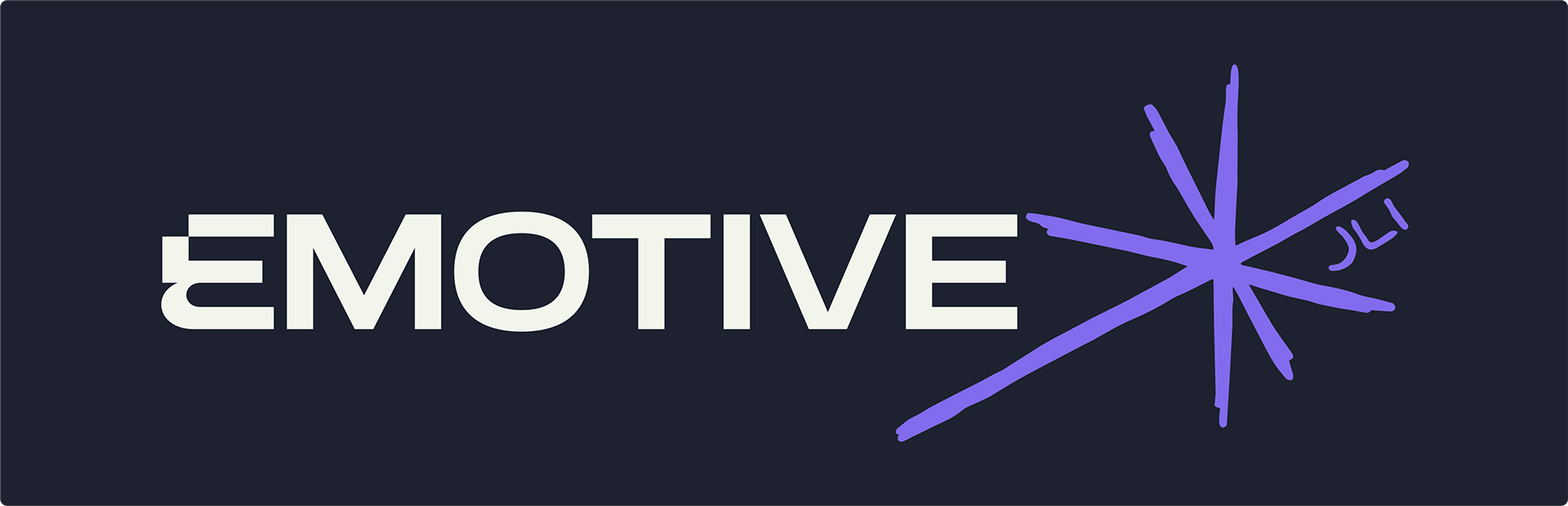
James Irving spent years scaling ThreatSpike from £2.5m to £10m, building the sales team from scratch and then training the next generation of people coming through. When he went out on his own, he needed a brand to match the weight of that experience.
EMOTIVE JLI is his consultancy. Sales training, structuring, management and consultancy for technical founders in the cybersecurity and IT space — the ones with great products and pipelines that still depend entirely on them. James is the person who fixes that.
The brief was a blank canvas. No visual direction, no moodboard, no “I want it to feel like…” Just a name, a niche, and a person with a lot of conviction. My favourite kind of nightmare. 😄
What role do I play in this project? I worked directly with James as the sole designer across the full identity. From the initial concept presentation through to brand guidelines and supporting assets. James built his own website off the back of the guidelines using Claude Fable and Loveable, which is always a good sign the docs did their job.
Building the mark
I presented four concepts. The Spark was the one… and my favourite too, so everyone won.
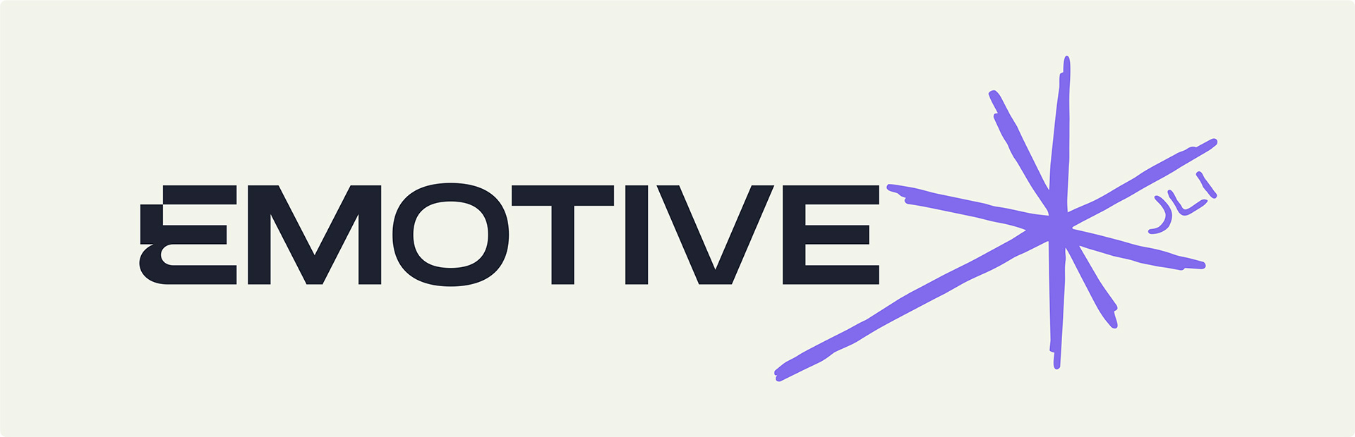
A hand-drawn asterisk sat on an extended upward trend line, rising up from the O in EMOTIVE. The asterisk is one of the most loaded punctuation marks going… it signals something worth paying attention to. Here it signals James. The spark he brings into a business when he arrives to sort the pipeline out.
The mix of geometric wordmark and hand-drawn mark does the whole brief in one lockup. Art and science. Person and process. It doesn’t look like anything else in the sales consultancy space, which was very much the point. His audience is cybersecurity founders, and the category is full of polished, cold, corporate identities that all look the same. James, however, is not corporate at all so his brand had to reflect this.
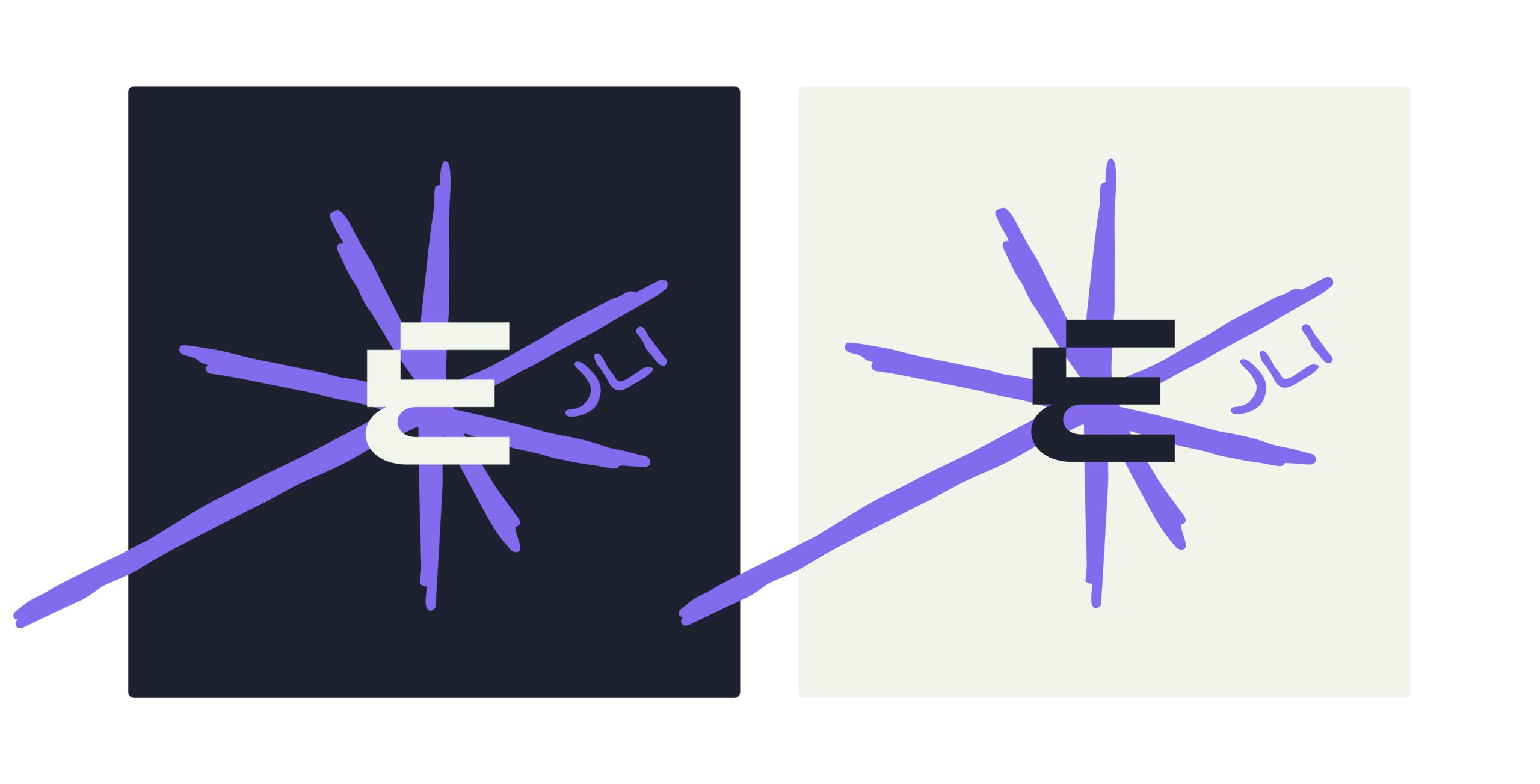
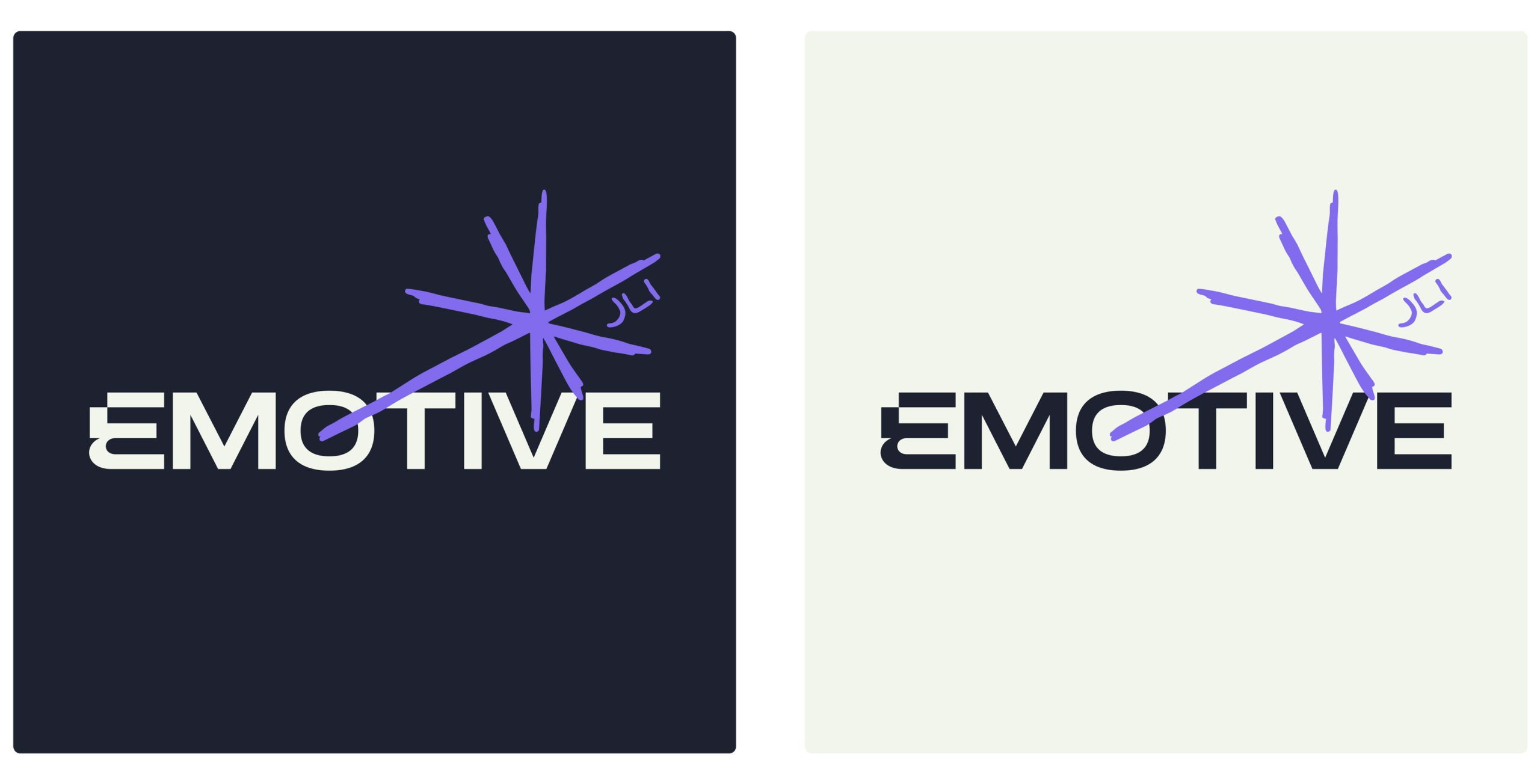
Three logo variations cover every application: stacked for square formats, inline for website navigation and wider spaces, and a compact version for favicons and profile pictures. The compact version centres on the E and isn’t afraid to let the asterisk run out of the box and be cut off. Being different was the brief, after all.
Colour Palette
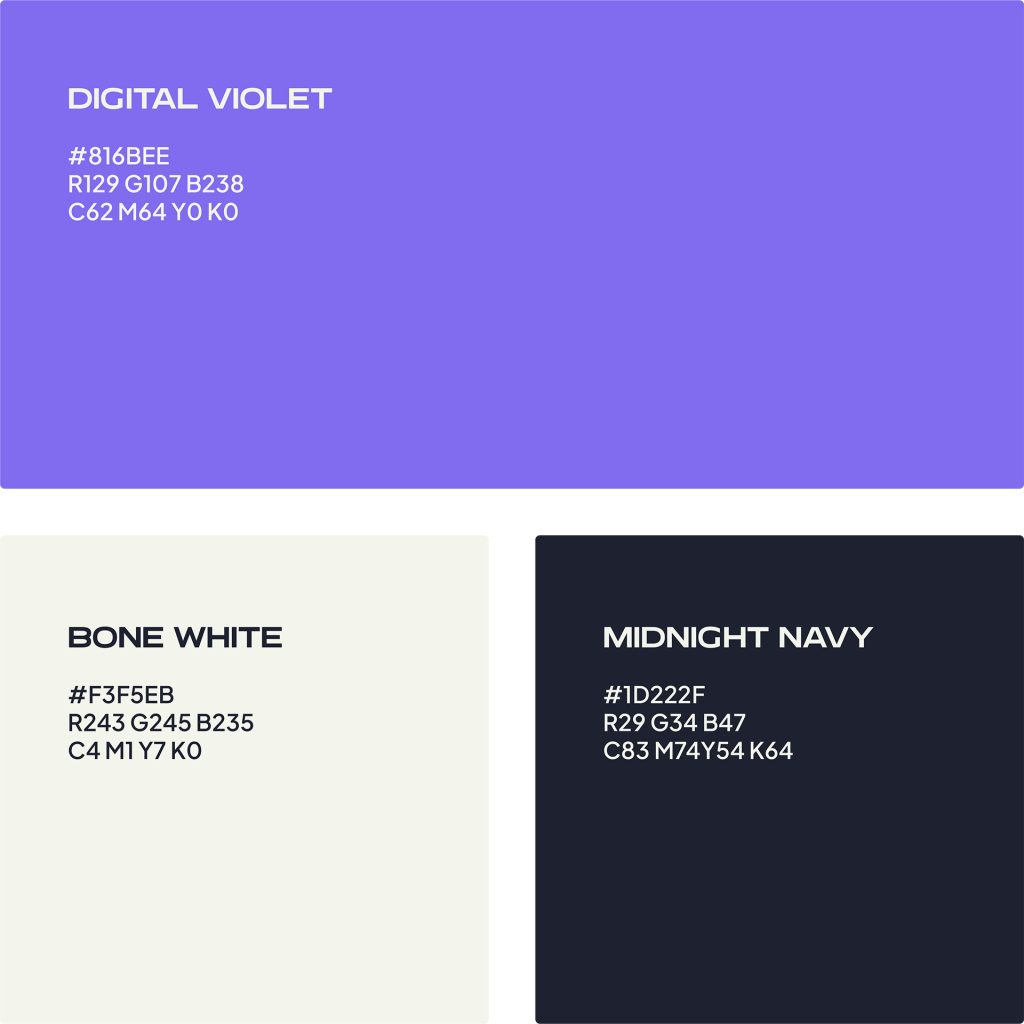
Three colours. Digital Violet places him firmly in the cyber and IT world without needing to say it out loud. Midnight Navy gives the brand its dark, confident base. Bone White (warmer than it sounds) stops the whole thing feeling cold and corporate.
The violet is primarily a digital colour and that’s fine, because James’s world is almost entirely digital. If print ever comes up, there’s a darker, more saturated fallback that behaves better in CMYK.
typography
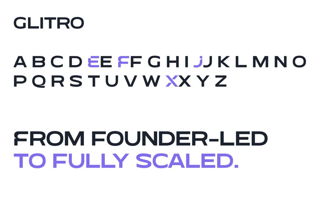
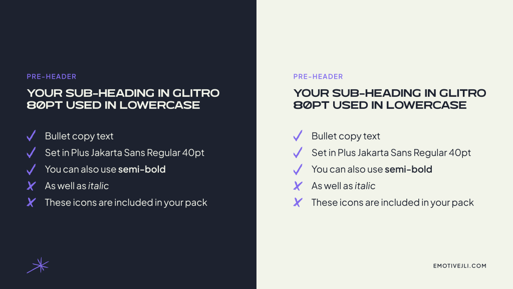
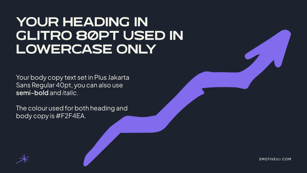
Glitro handles headings and display text in lowercase… with one exception. E, F, J and X may use their uppercase glyphs at the start of a sentence, a quiet nod to the cyber world.
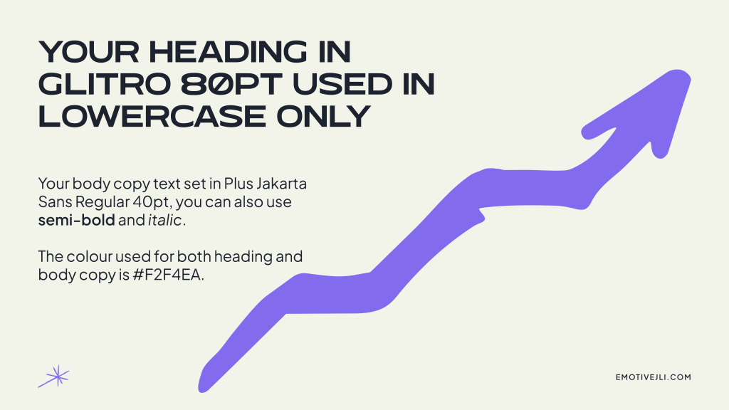
Plus Jakarta Sans handles everything else. Regular, italic and semibold. It’s a free Google Font, which means James can use it consistently across his website, documents and social content without worrying about licensing. Practical as well as considered.
Brand guidelines
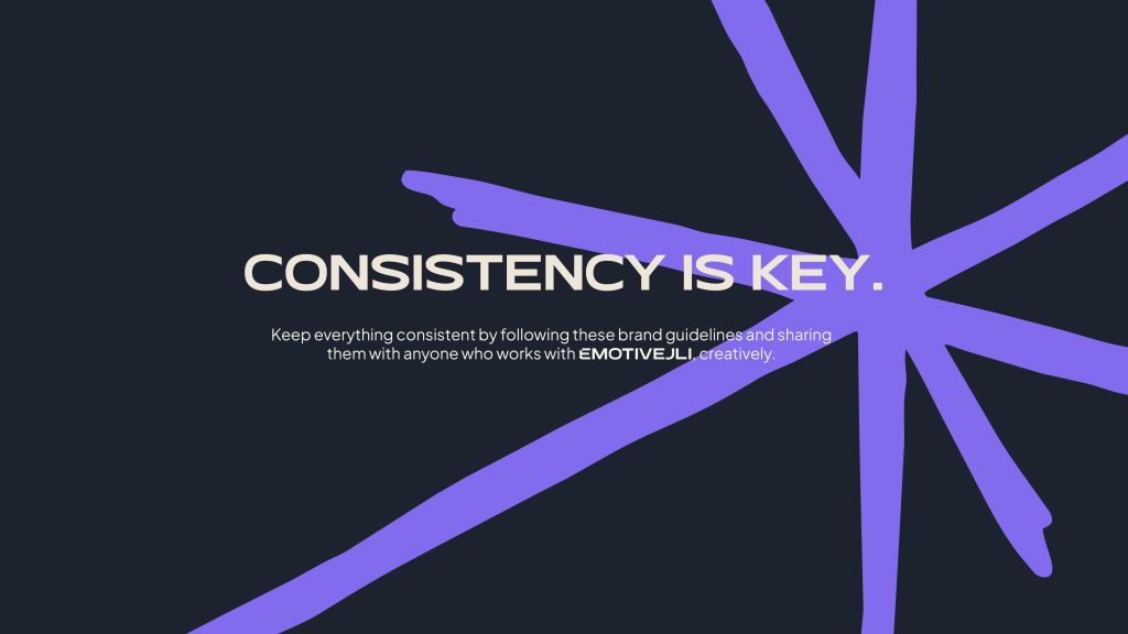
The guidelines cover logo usage (all three variations, all colour options), clear space, what not to do, the full colour palette with hex, RGB and CMYK values, both typefaces with usage rules, and a set of hand-drawn branded icons – ticks, crosses, currency symbols, upward trend arrows, speech marks – all in Digital Violet. These are the details that turn a logo into a brand system.



Supporting assets
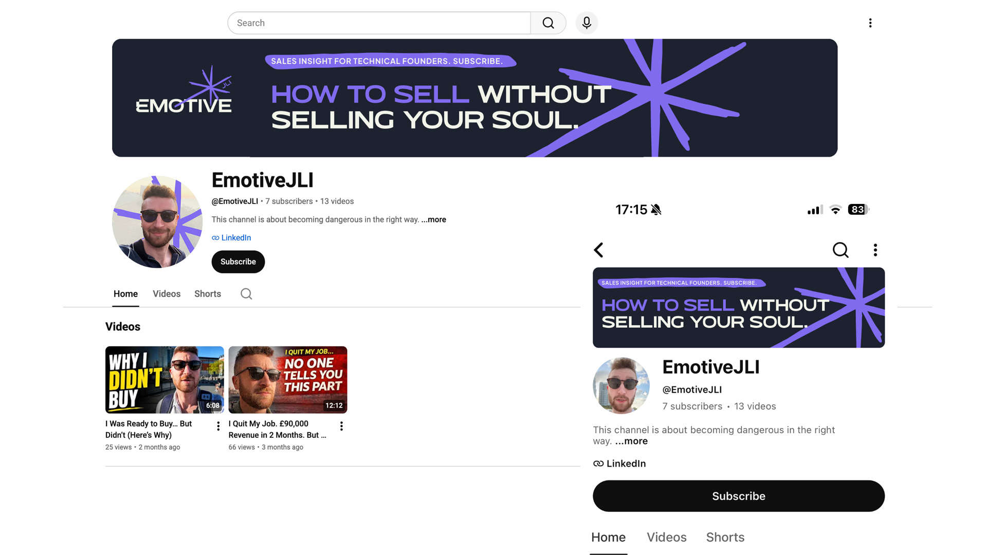
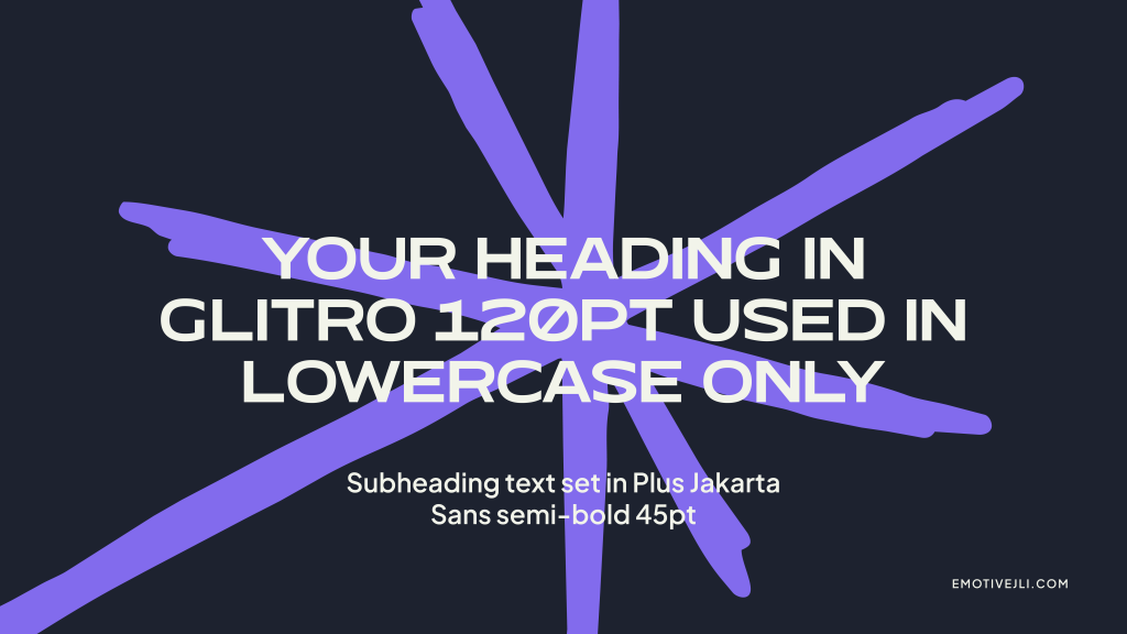
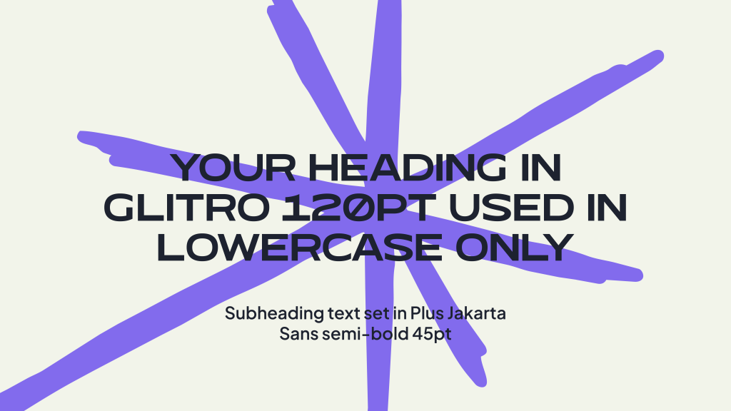
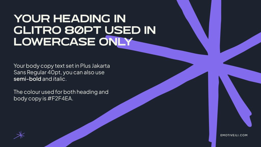
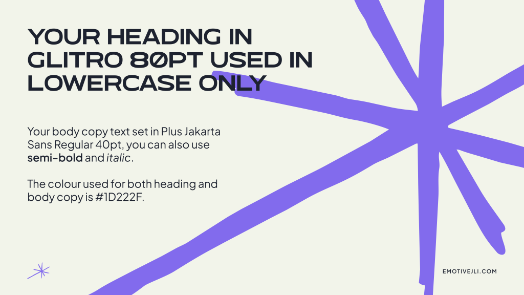
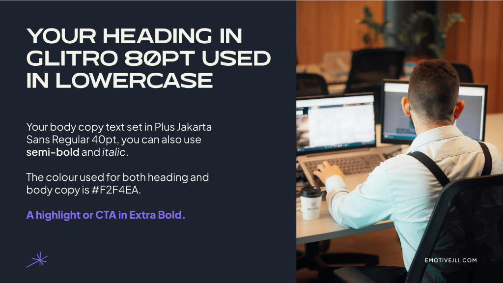
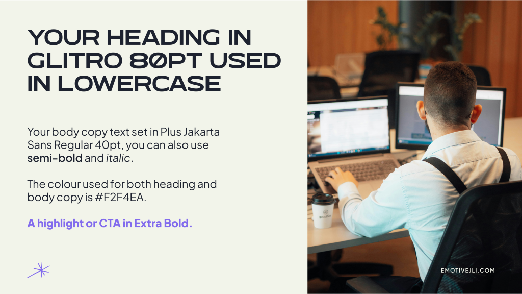
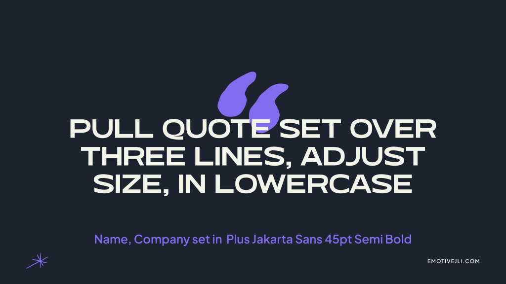
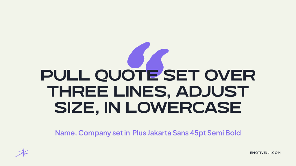
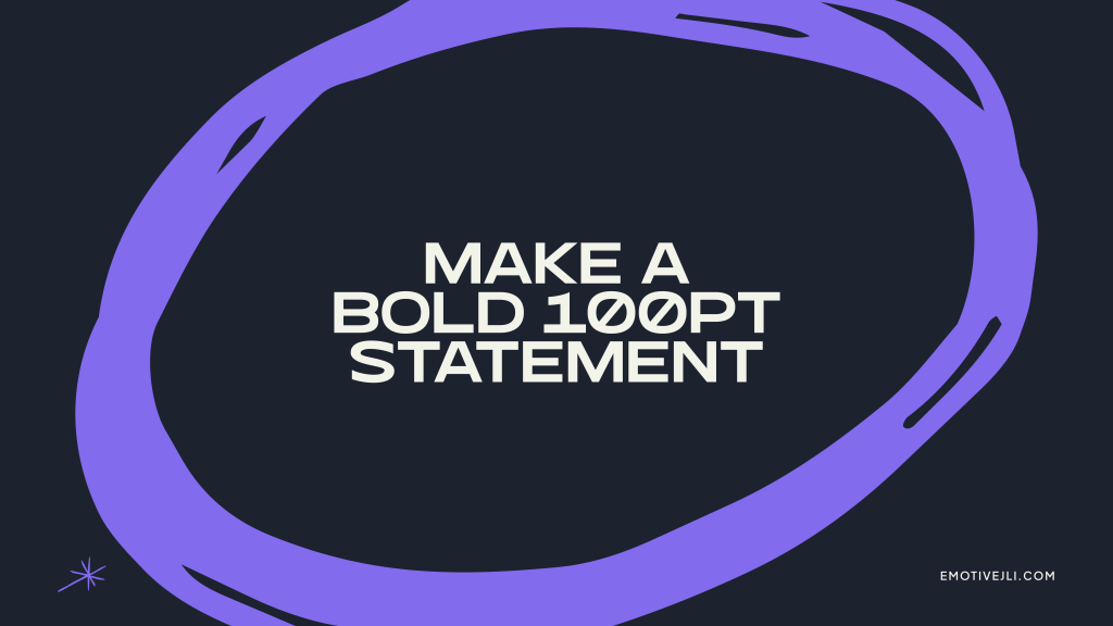
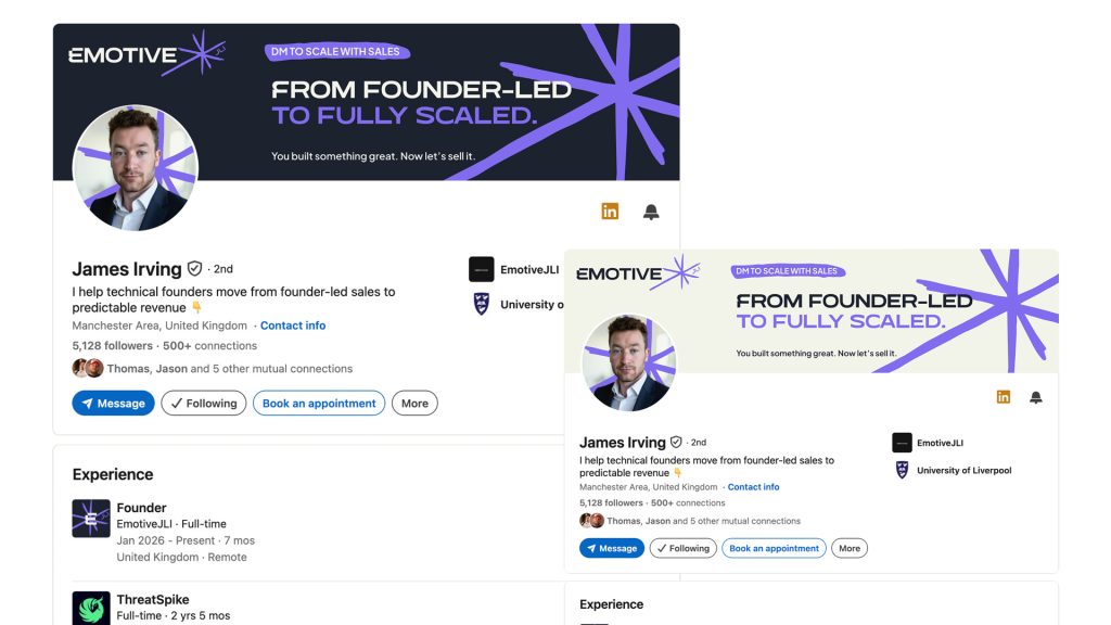
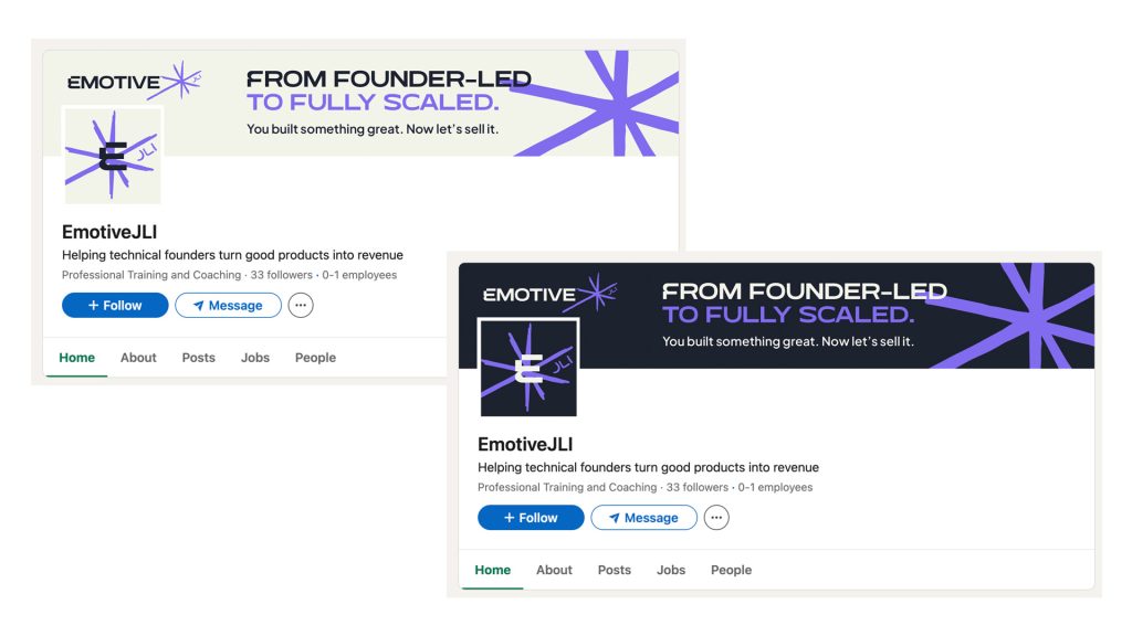
Once the identity was locked, I created LinkedIn banners, a YouTube banner, YouTube thumbnail template, presentation backgrounds and profile images. All built to the guidelines, all ready to use across the platforms where James spends his time.
youtube branding + thumbnail templates


presentation template
Linkedin Personal + Company
Icons
Currency symbols, trend arrows, a speech bubble circle, highlight strokes, the asterisk and more – extend the hand-drawn quality of the logomark into the wider brand, so everything feels like it came from the same place. All in Digital Violet, ready to drop into social posts, pitch decks and the website.

What happened next?
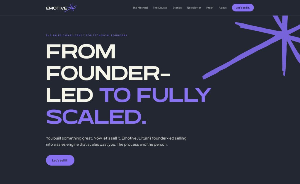
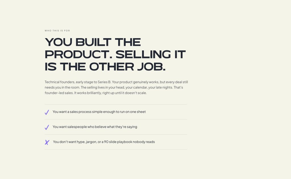
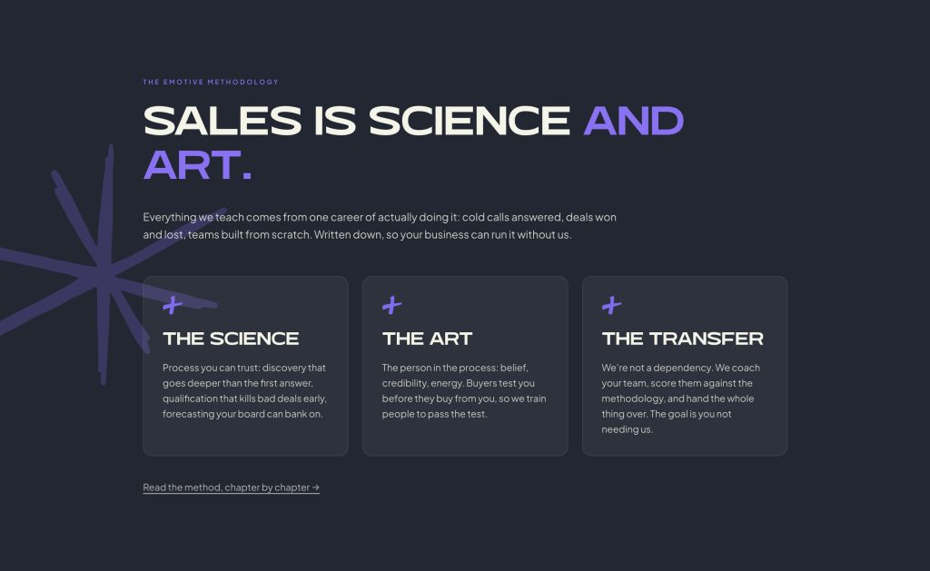
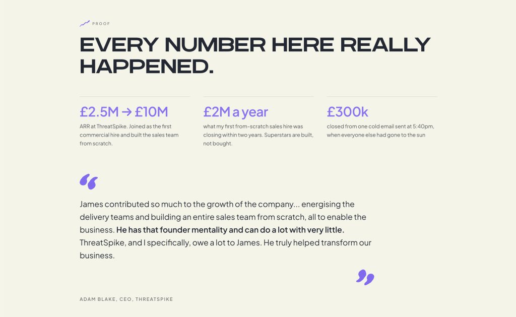
James built his own website off the brand guidelines – emotivejli.com – using Claude Fable and Loveable. I can’t take credit for this build but it looks the part.
The Midnight Navy base, the inline logo in the nav, the asterisk used as a graphic device throughout… he followed the system and it held up.
Looking for your own branding? Email me.
Find out more about my branding design process in the Clique Mojo project.
A few other logo marks from across the years…


