
Overview
Amy and I have been working together since 2021… and what started as a logo project turned into something much bigger.
CERCo. is the anti-boring cyber training company. Physical escape room games sent to companies in backpacks and boxes, large scale installations people literally walk inside, online experiences, vishing training… all designed to build genuine security culture rather than make people sit through another PowerPoint. Honestly, it’s brilliant.
As the business has grown, so has what we do together. I handle everything visual, the brand identity across CERCo. and all its sub-divisions, game manuals, marketing assets, certificates, studio photography and templates the team can actually use themselves.
Amy knows the brand is in safe hands. I know the business well enough that she rarely has to explain twice. *mic drop*
Together we’ve accomplished:
- Strong visual consistency through all of The Cyber Escape Room Co.
- Manuals for each ESC game, creating a cohesive and easy to read through experience.
- Studio photography for all ESC games which helps with all my design work.
- Branding for The Cyber Escape Room Co. and it’s sub-brands.
- Template based creations so the team can edit as needed, using both InDesign and Canva (whichever works best for the application and the team members using it).
What role do I play in this project? I work directly with the founder and handle all the design you see in this project (and beyond). I’m the sole designer but Amy likes to get stuck into the creative side too.
Building a visual system from one key
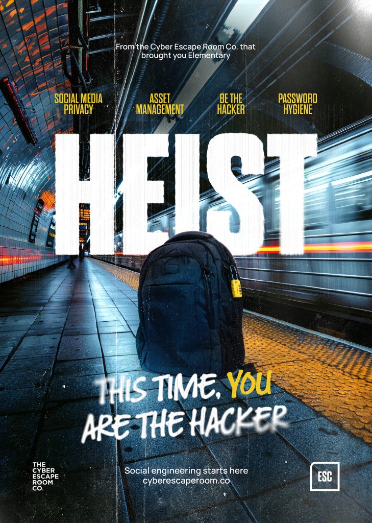
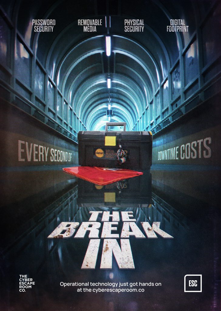
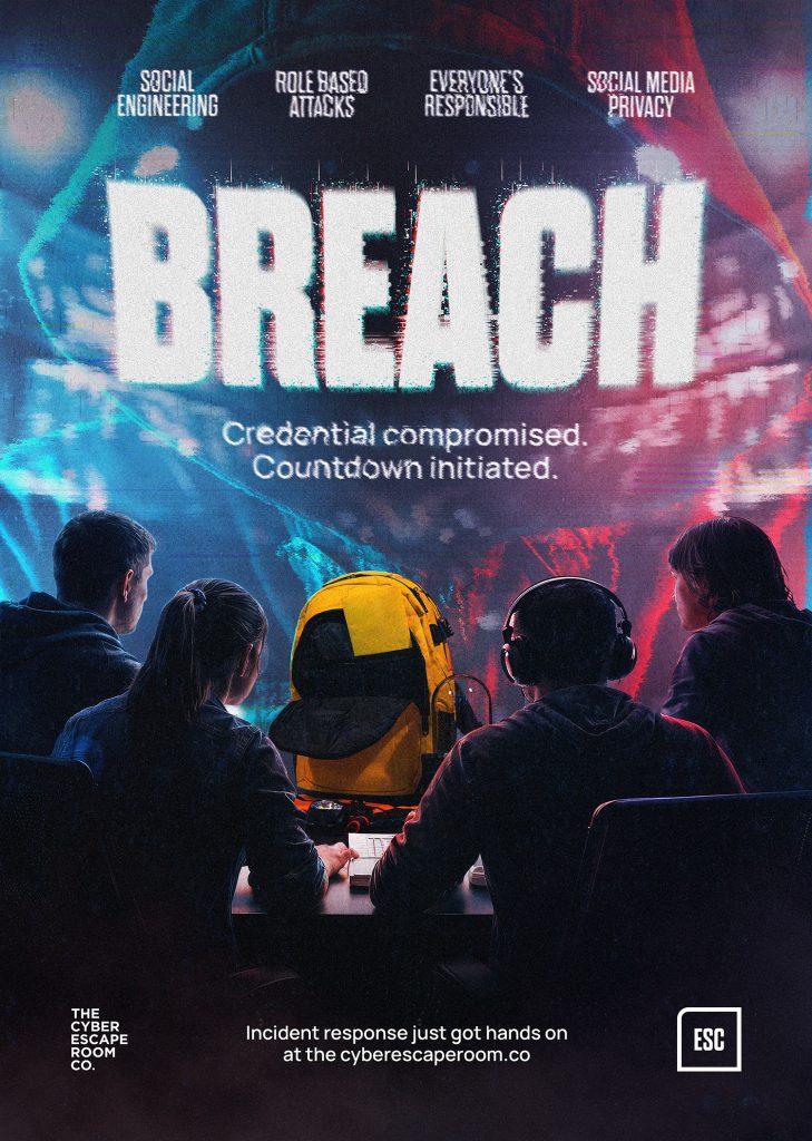
We started with a simple idea — the ESC key from a keyboard. That shape became the foundation for everything: button shapes, image masks, division logos.
As the business grew, ESC became a division in its own right and CERCo. stepped up as the parent brand, each sub-division with its own slightly different look but unmistakably the same family.
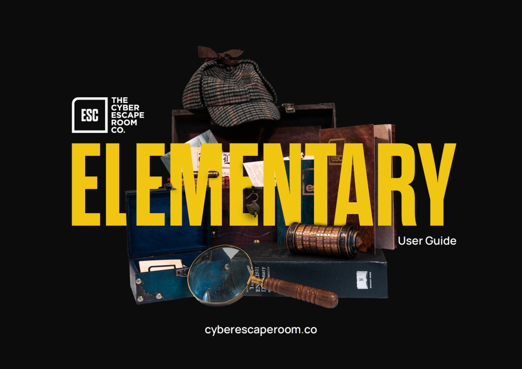
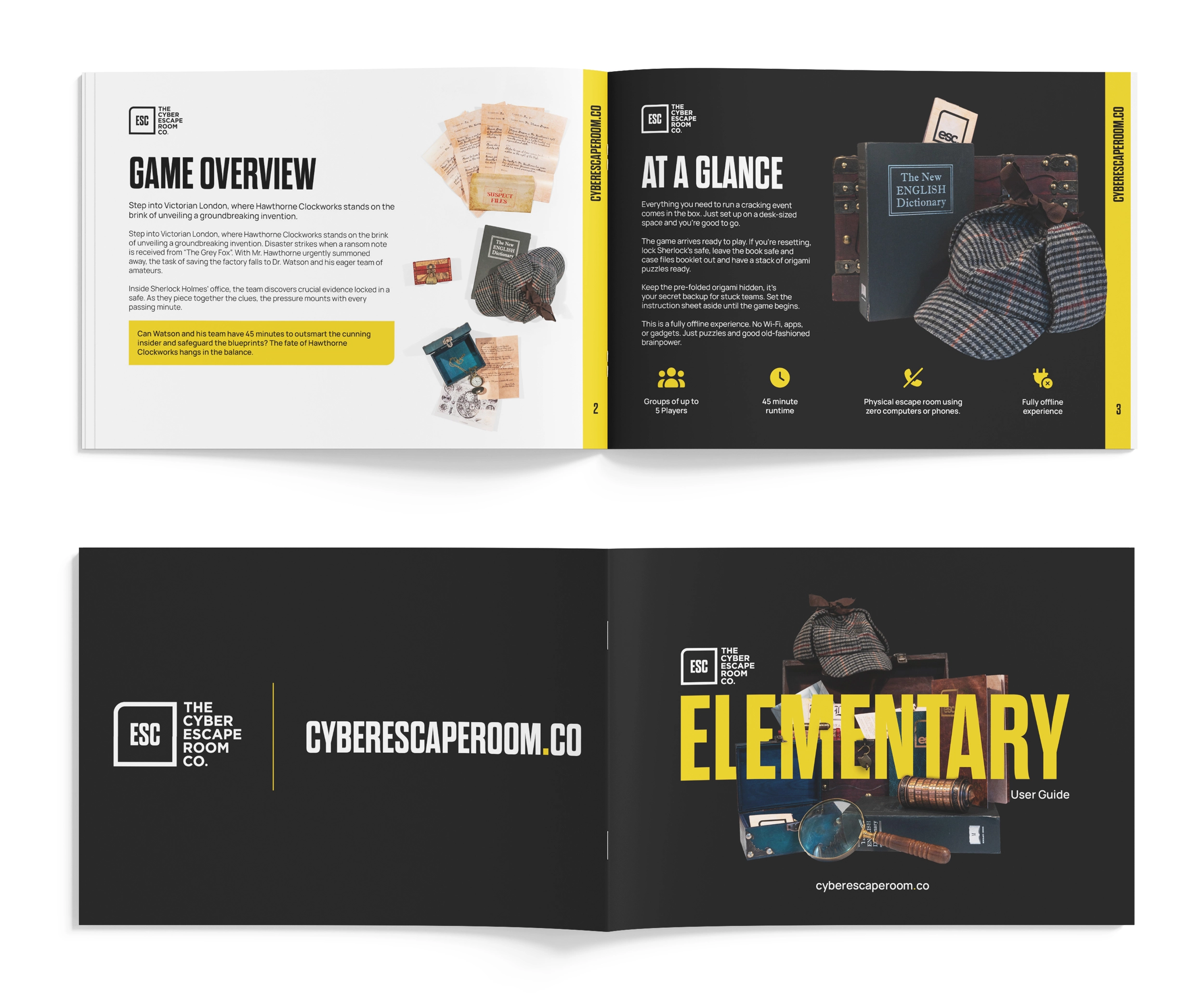
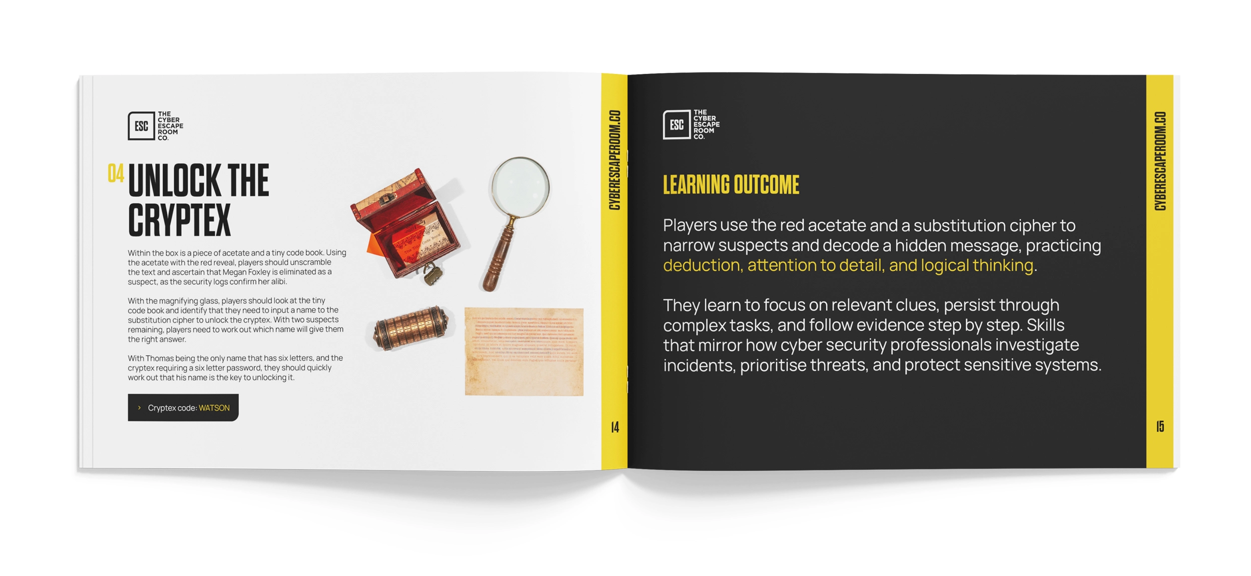
Manuals people actually read
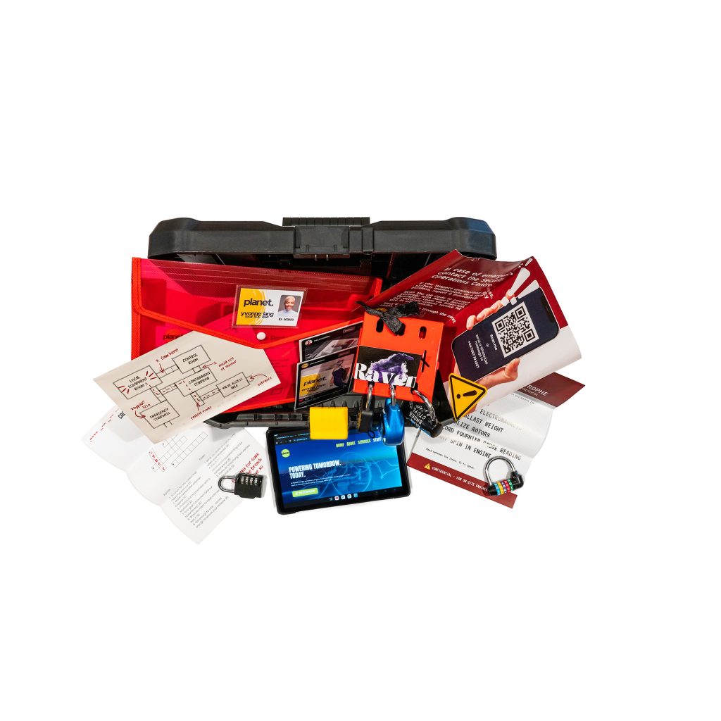
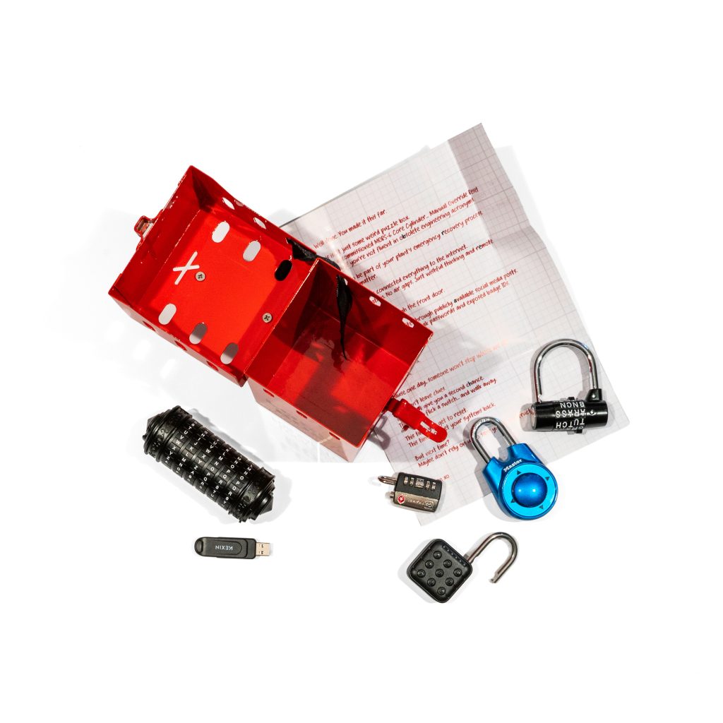
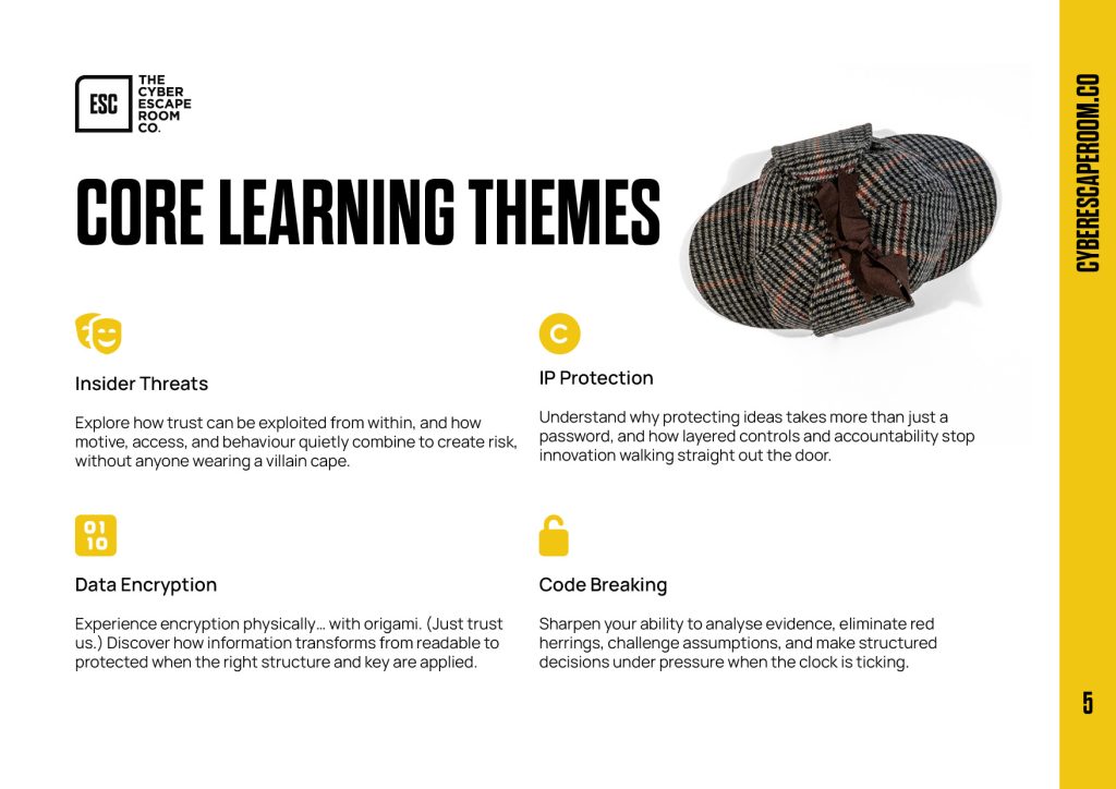
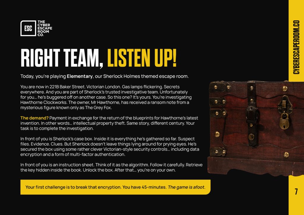
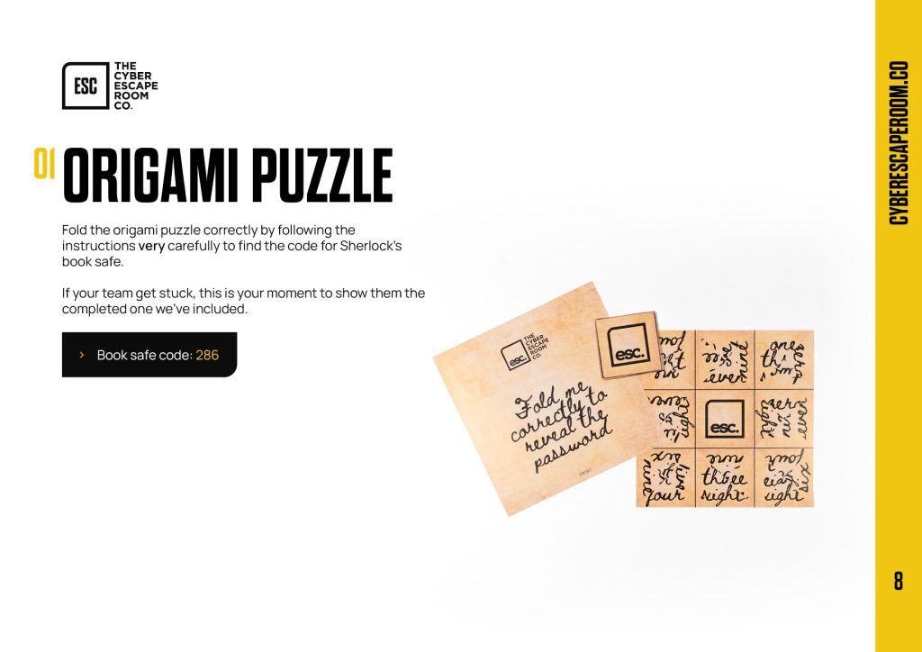
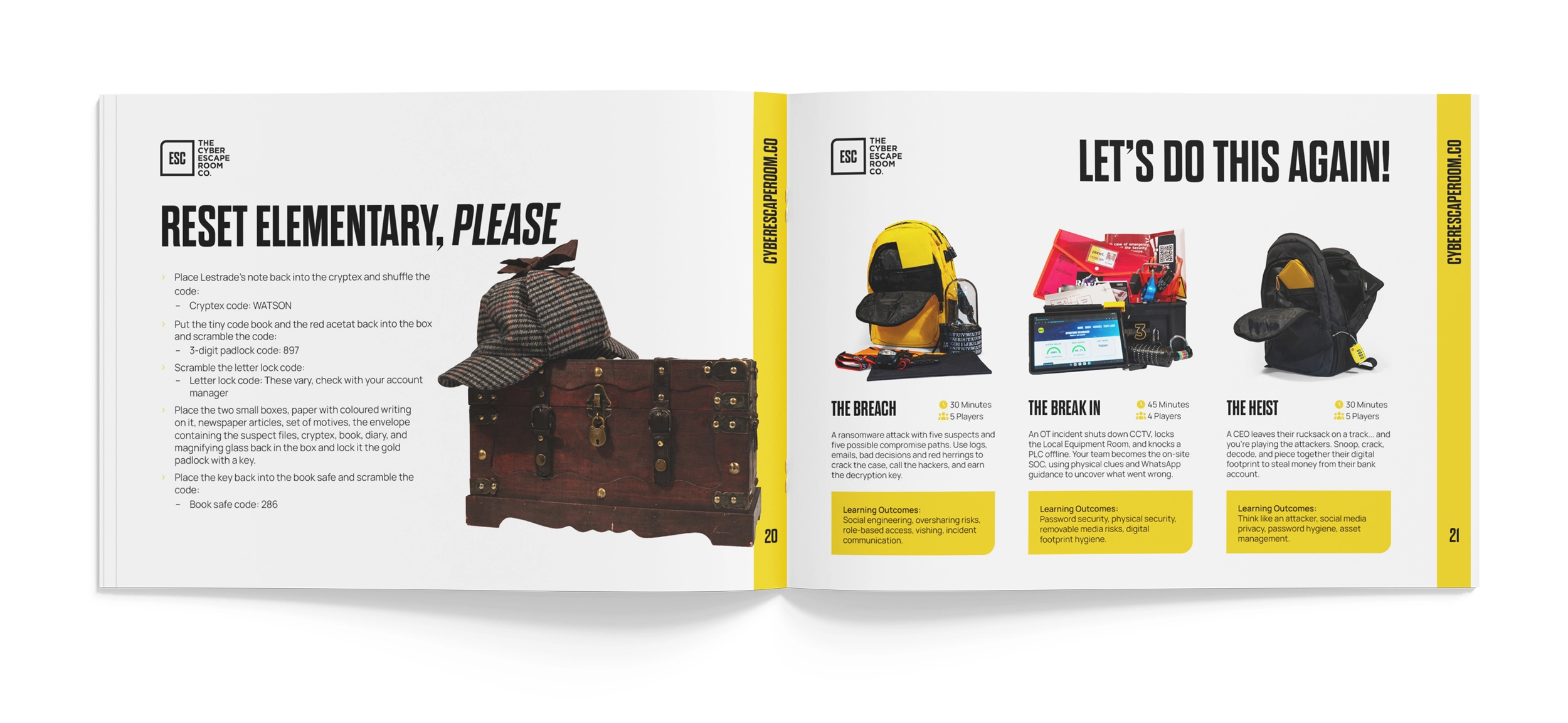
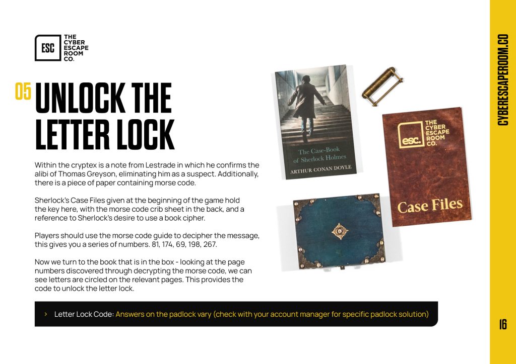
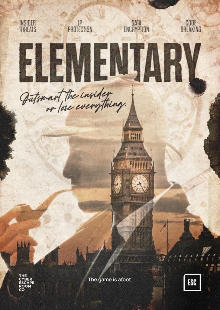
I redesigned each of the ESC manuals from scratch to bring them together with a consistent look, using plenty of white space so the reader can skim through easily. Photography of the escape rooms played a big part in these (more on this down the page).
Whilst they’re primarily used digitally, I also set them up ready to go to print with a few minor modifications, because having a physical document ditches the need to zoom in on a screen and your devices can be left in your pocket. Here’s a few pages from Elementary’s manual. Every manual follows the same structure so returning players already know their way around, and new ones don’t get lost.
A consistent look.
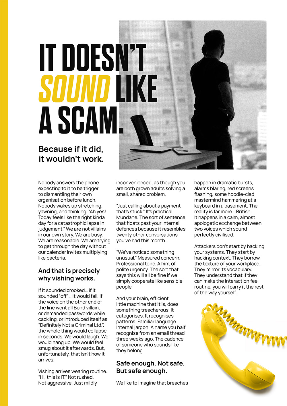
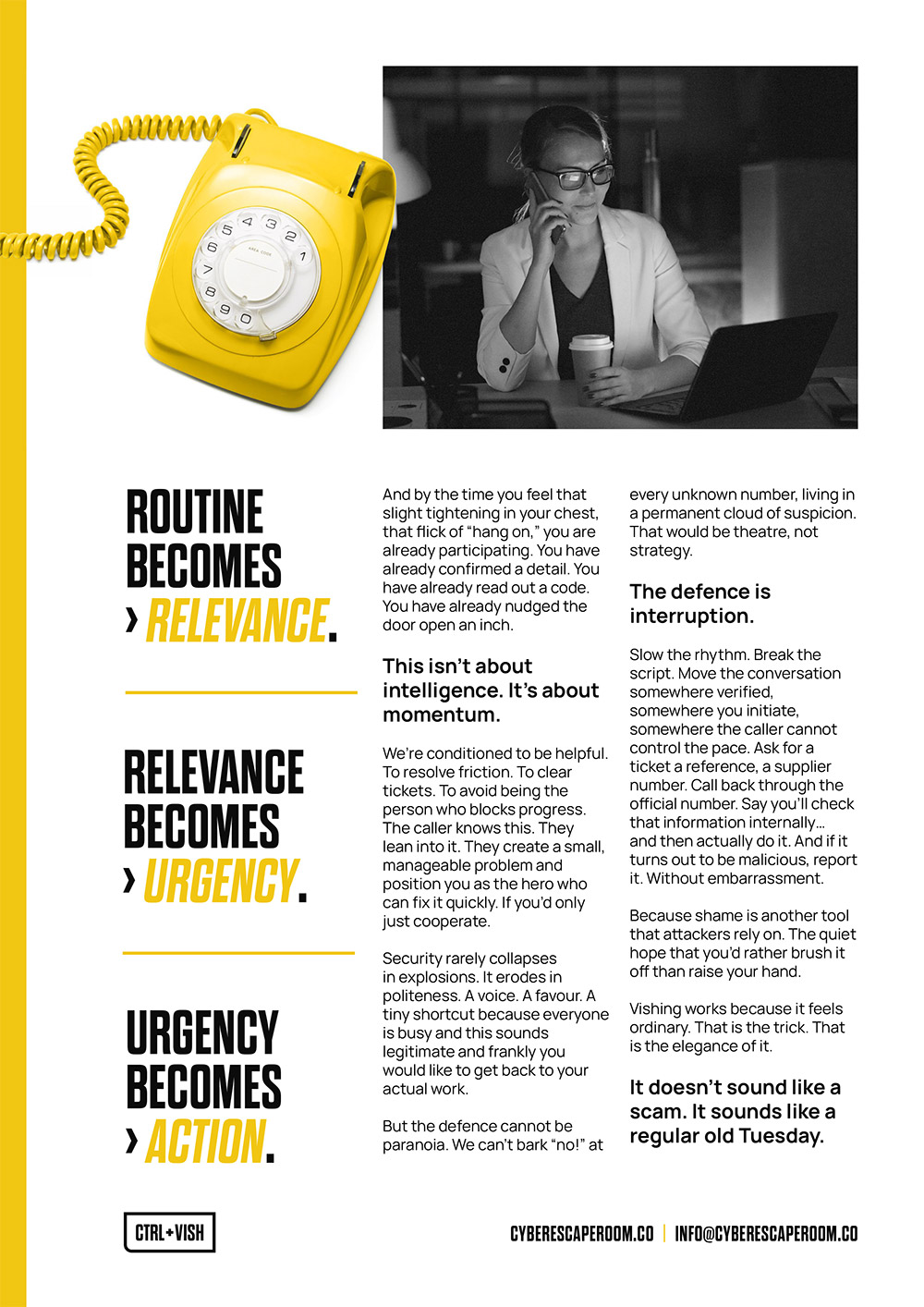
I’ve brought a lot of documents in line with this look so their visuals follow through from start to finish. From the proposals and quotes, to the marketing material and games themselves then also as you’ll see later, post-escape room certificates. Here’s an example of a editorial article for CTRL+VISH.
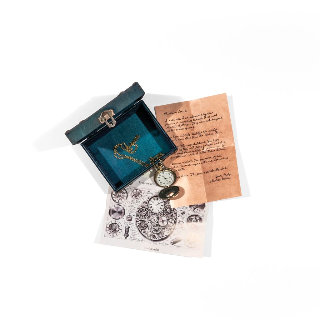
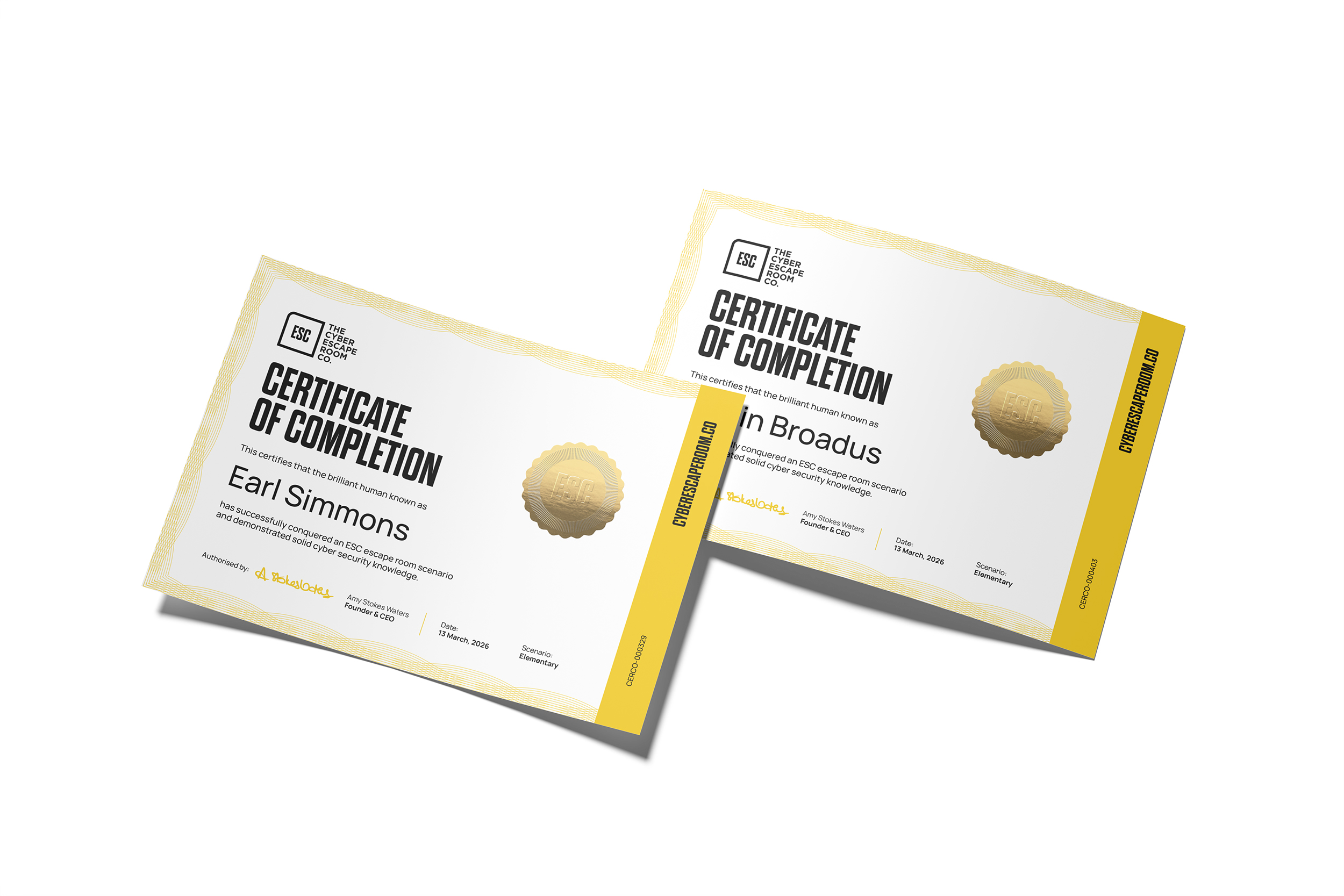
proof you survived
Once an ESC scenario is complete, players get a certificate. We wanted this to resemble a certificate people are proud to place on their walls but also be unmistakably CERCo.
These experiences are made for groups of employees meaning a fair few people go through these scenarios at once… so Amy linked this up to her automation in order for the certs to autofill and send. Fancy!
Livia was recommended when searching for a graphic designer to help design our brand, and well… I can see why she gets recommendations left right and centre. I wasn’t sure what to expect from the process having not working with a graphic designer before but Livia was absolutely fantastic. She took the time to get to know us as a business and really delved into our industry to come up with creative and innovative concepts for our logo.
She communicated fantastically, met every deadline and put up with us to-ing and fro-ing on ideas to make sure we had the design we love. I couldn’t recommend her more. She was just a delight to work with. THANK YOU Livia for helping at this critical stage in our business journey, being super lovely to work with and coming up with some amazing ideas! We’ll definitely be back when we need more design services in the future!
— Amy Stokes-Waters, Founder of The Cyber Escape Room Co.
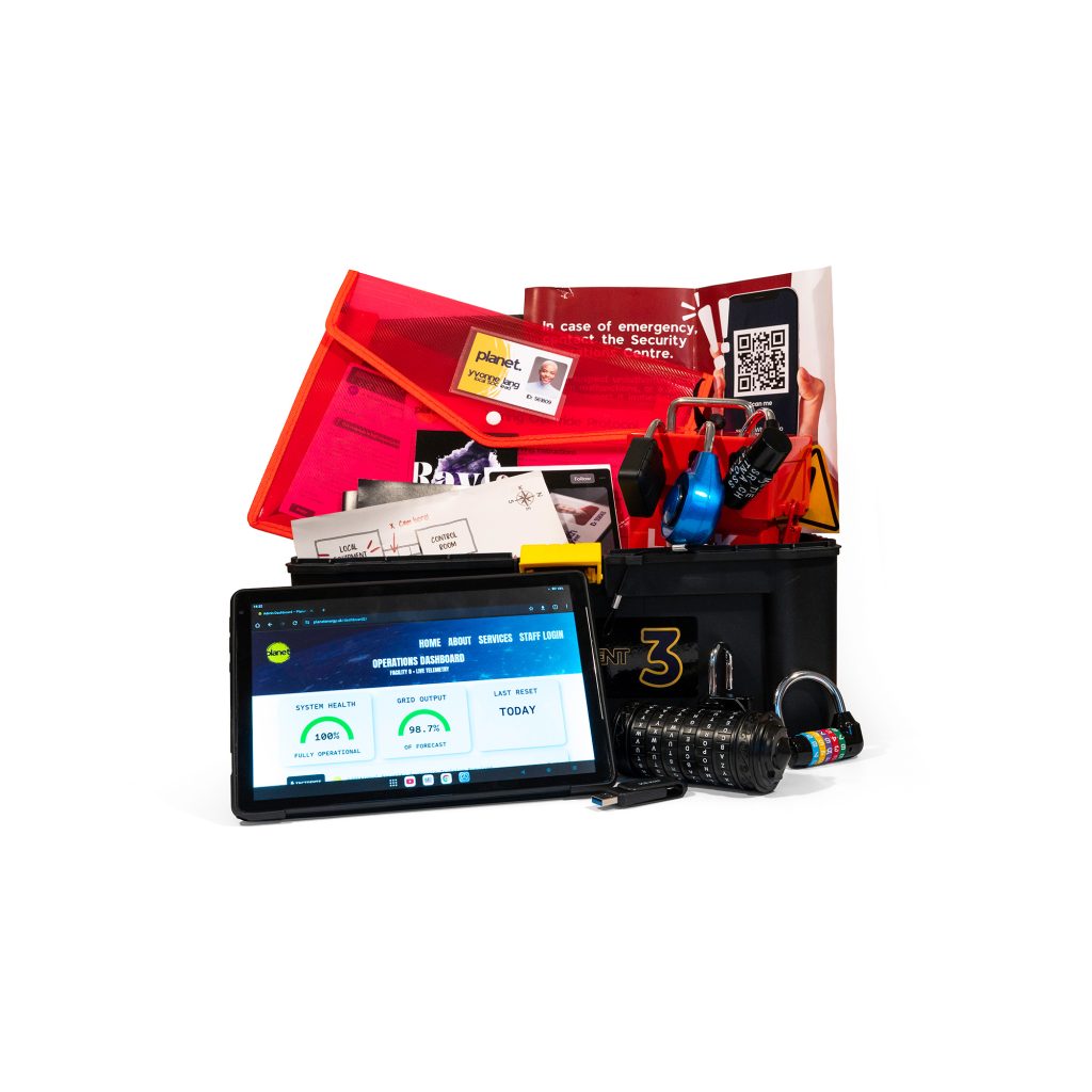
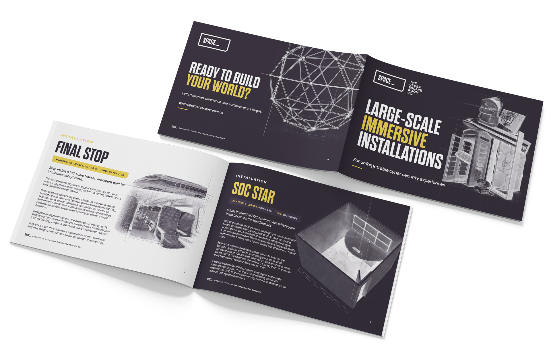
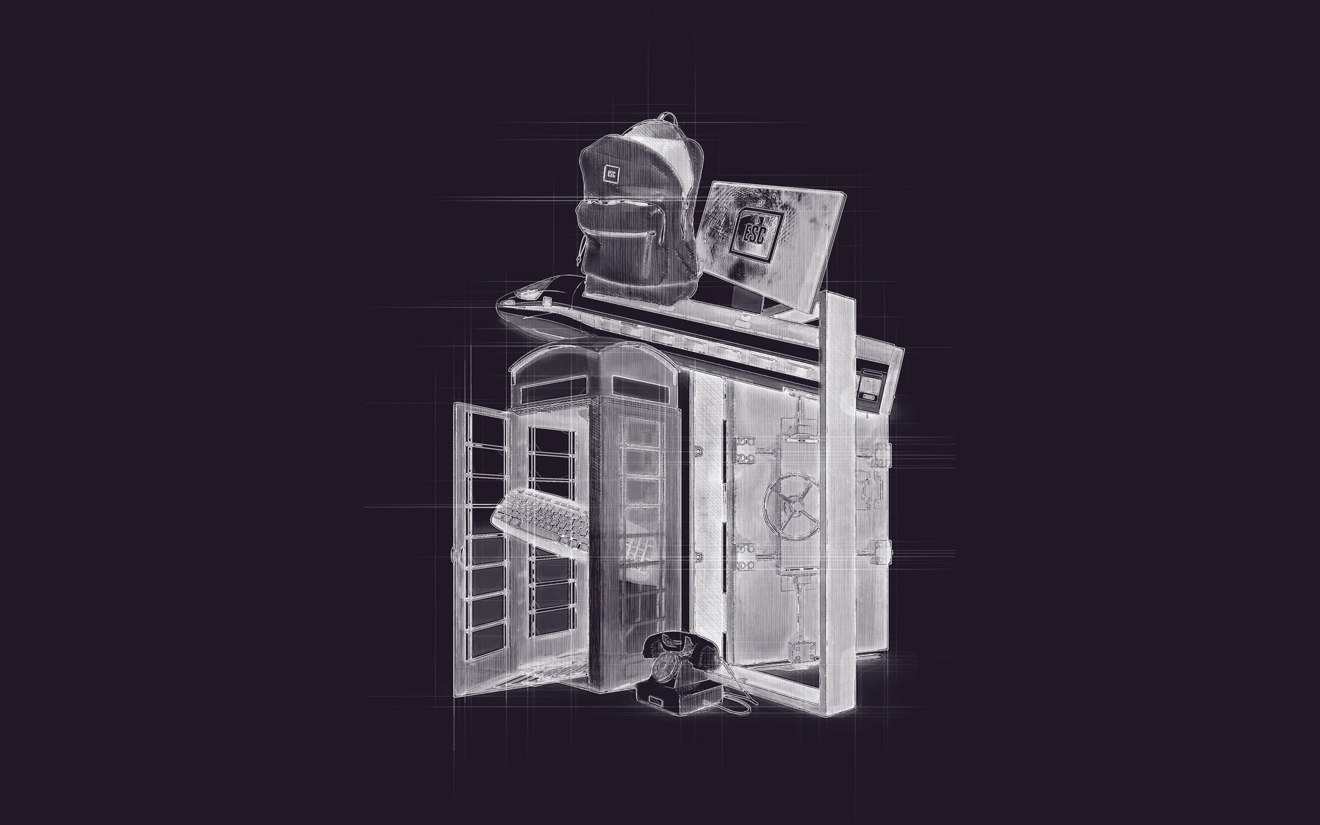
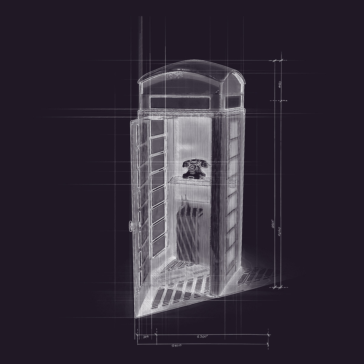
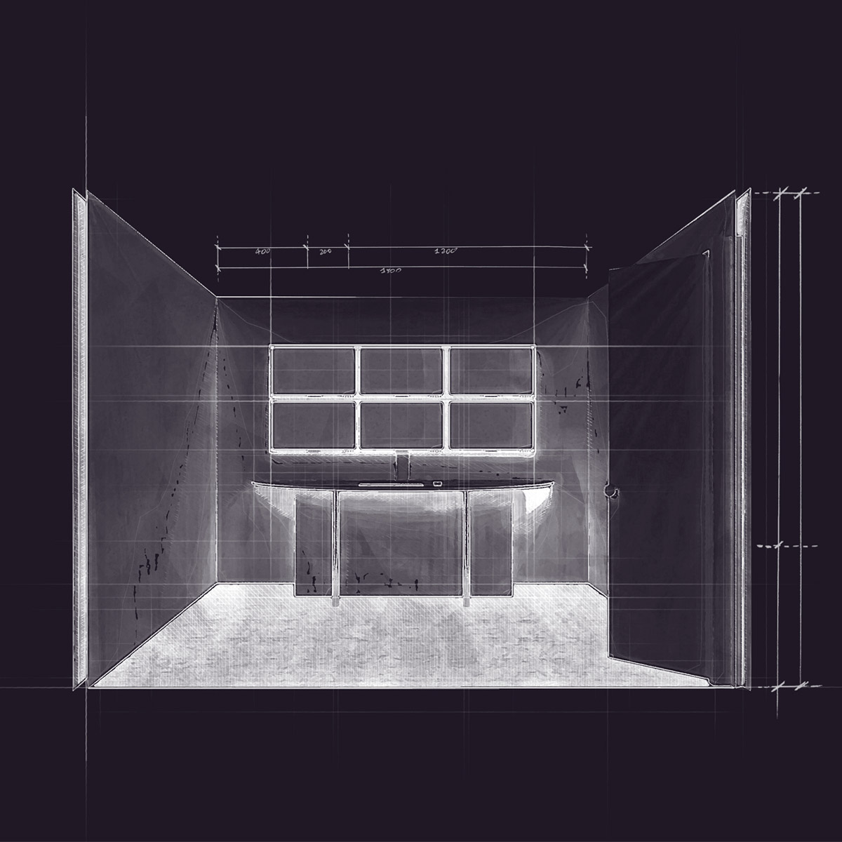
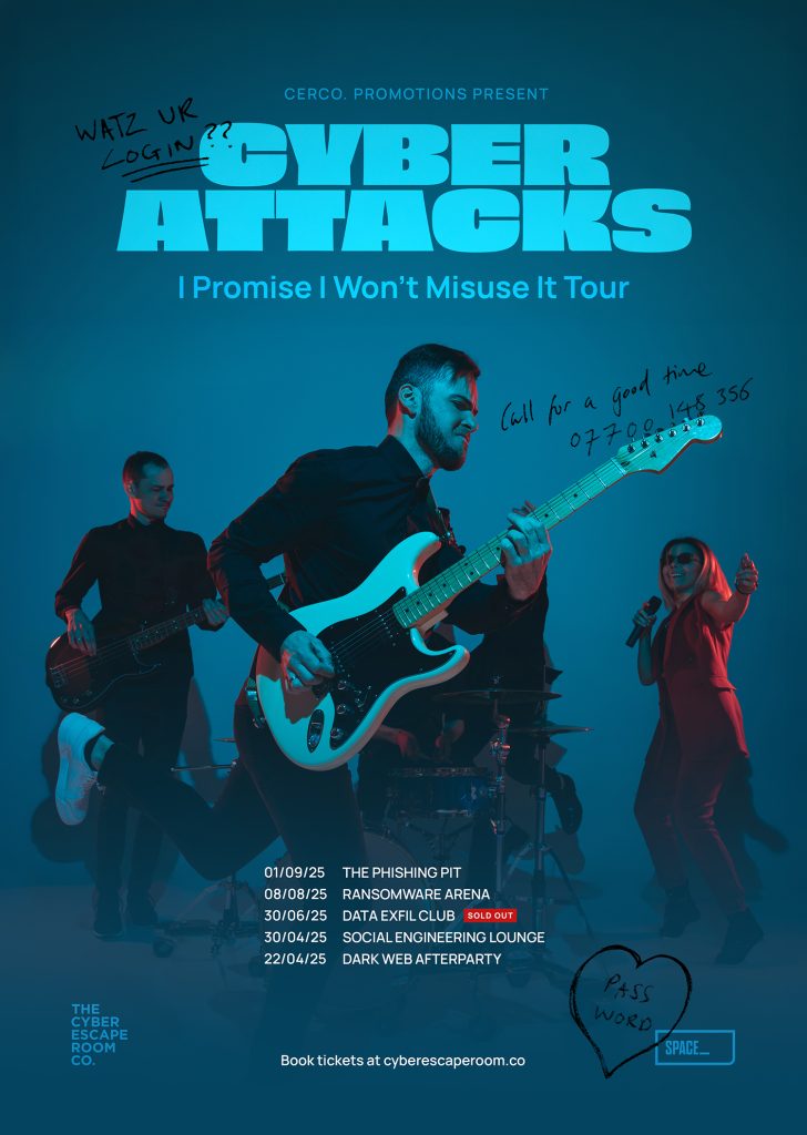
Going upscale with SPACE_
Space has a slightly more upscale look to it using the dark plum. Amy wanted to see blueprint style imagery within these as they are large scenarios which people work inside of in order to solve the issue at hand. Literally, phone booths, a SOC room, a train…
creative assets
These experiences need dressing as well as advertising… so I created assets for both. Used within the phone booths themselves (see the added graffiti on the gig poster) and provided to clients to promote the experience to their own staff.
Everything’s been built so client logos and dates can be dropped straight in. Because the alternative is comic sans posters around the office and we don’t stand for that. 😬
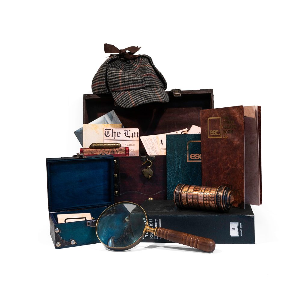
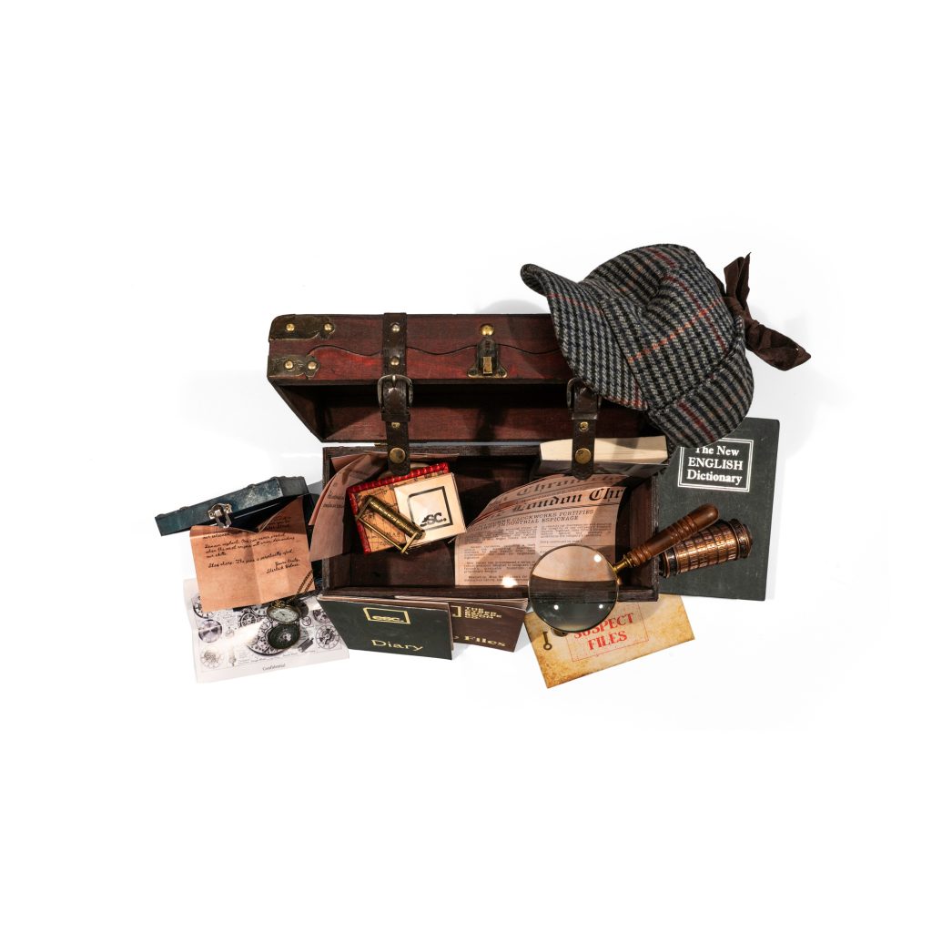
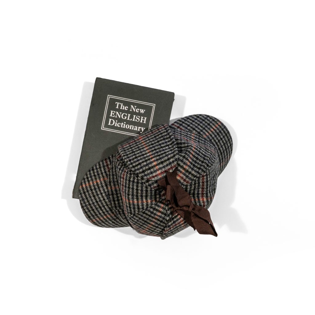
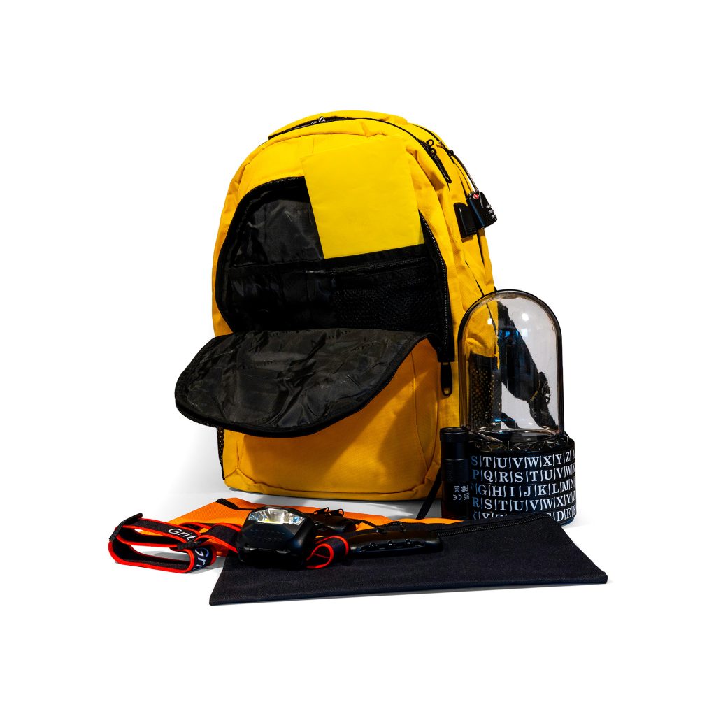
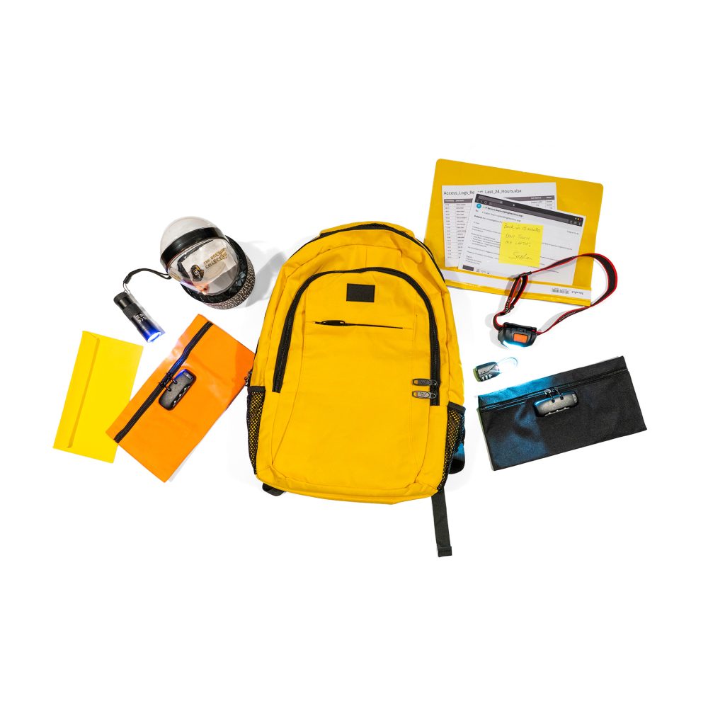
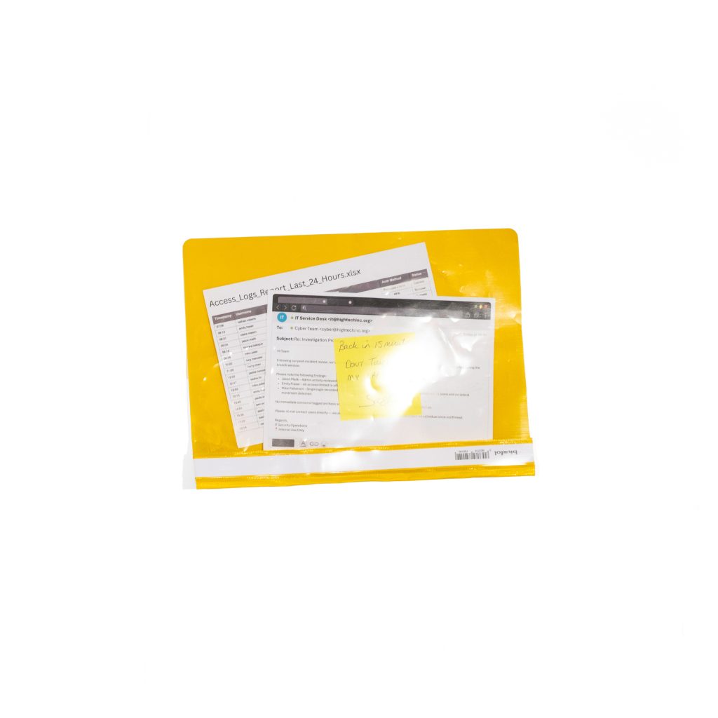
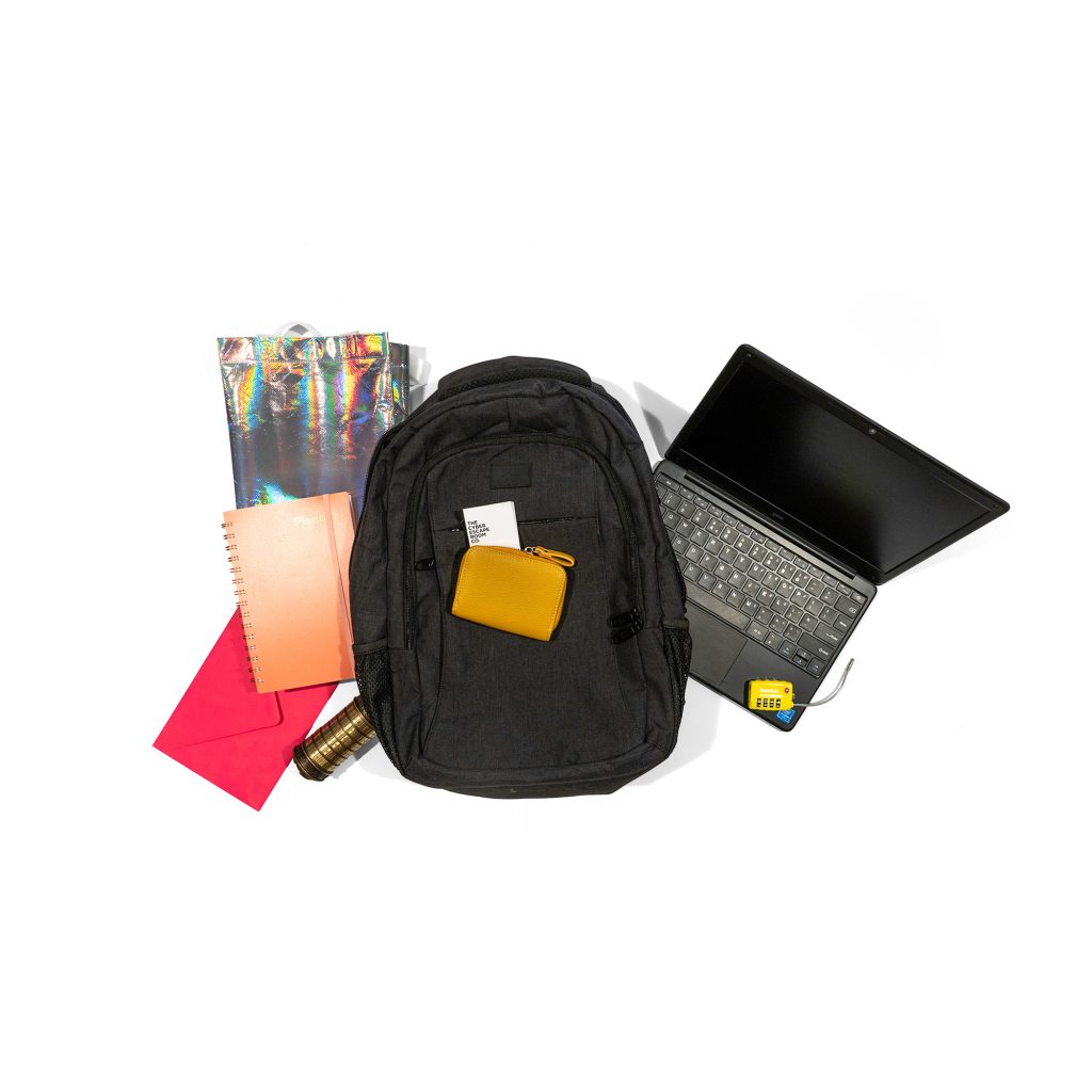
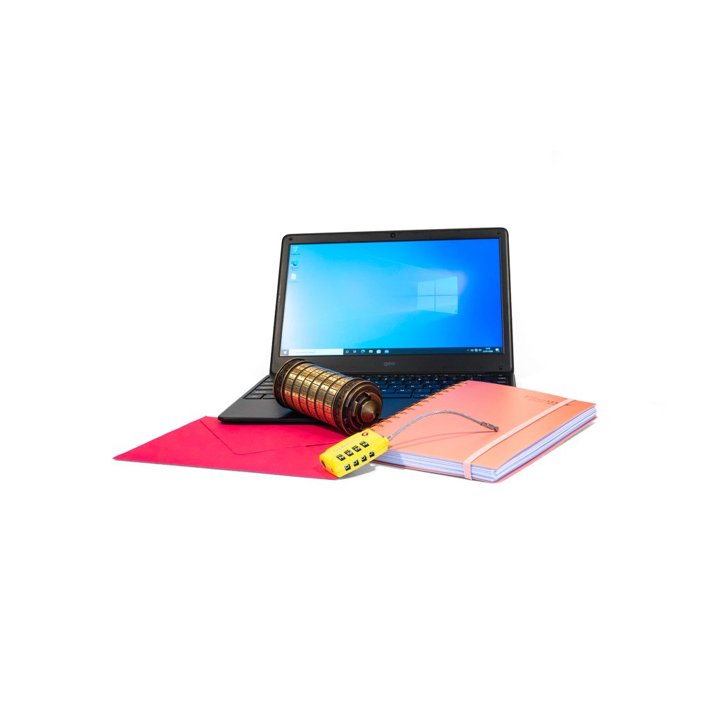
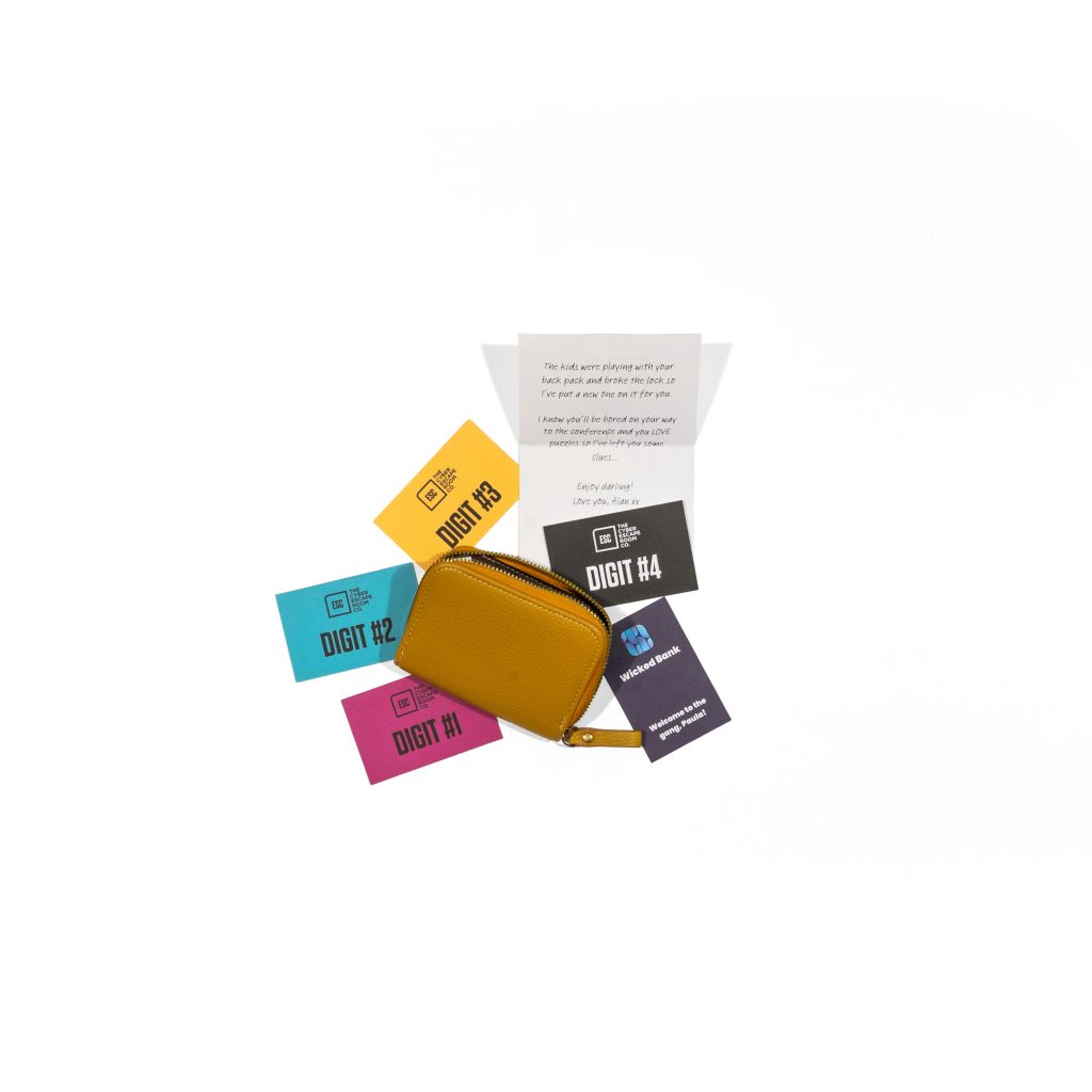
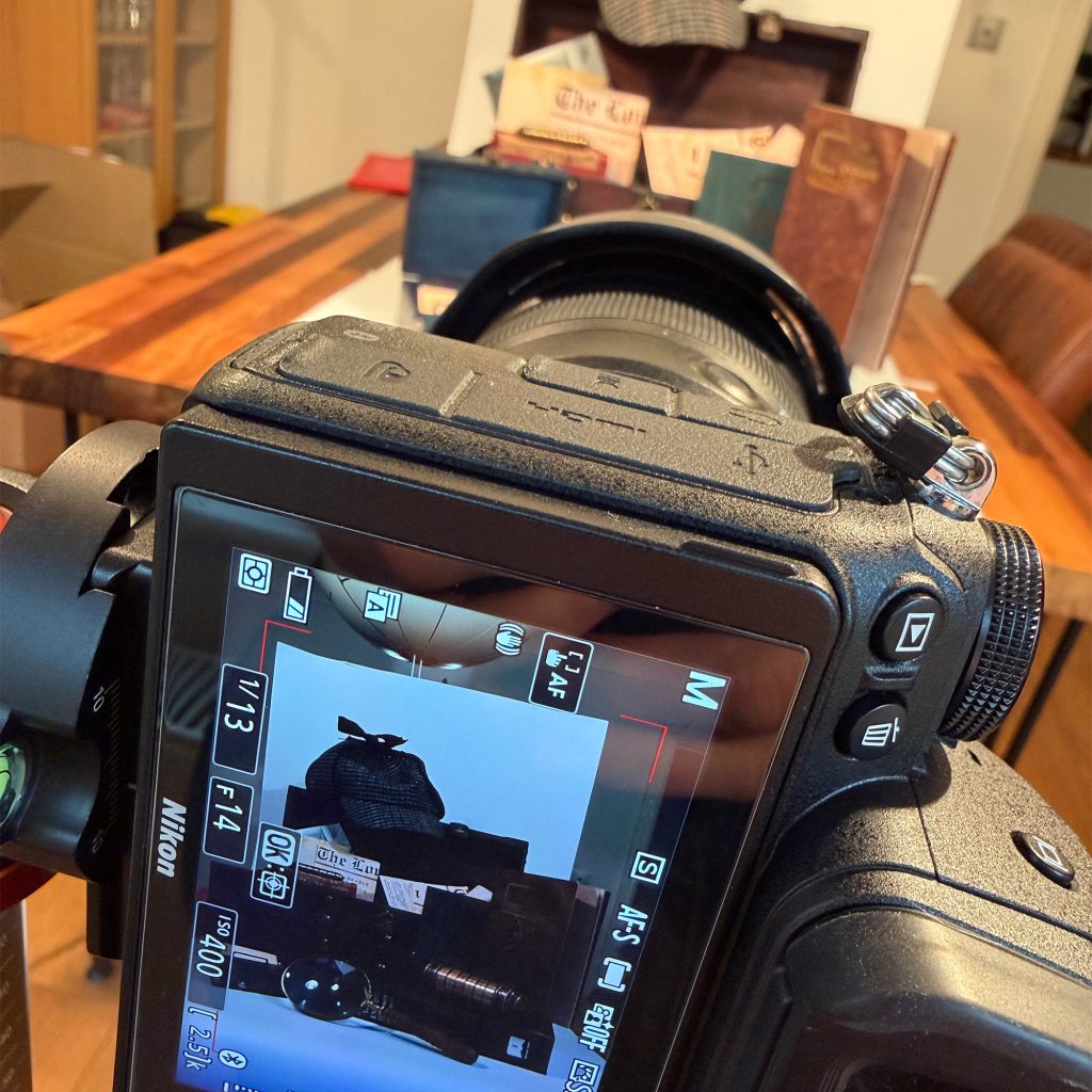
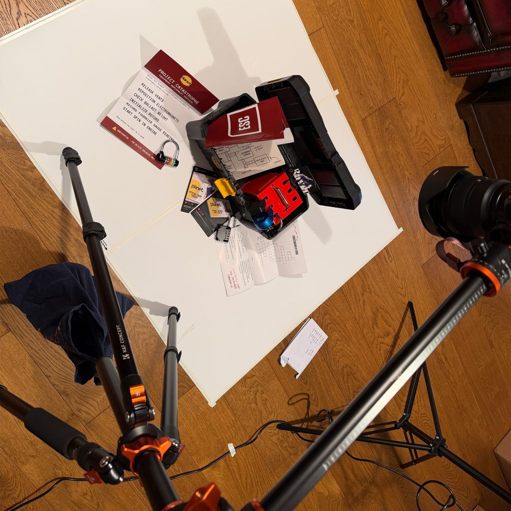
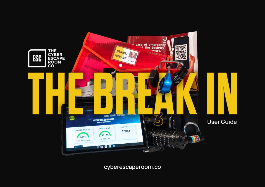
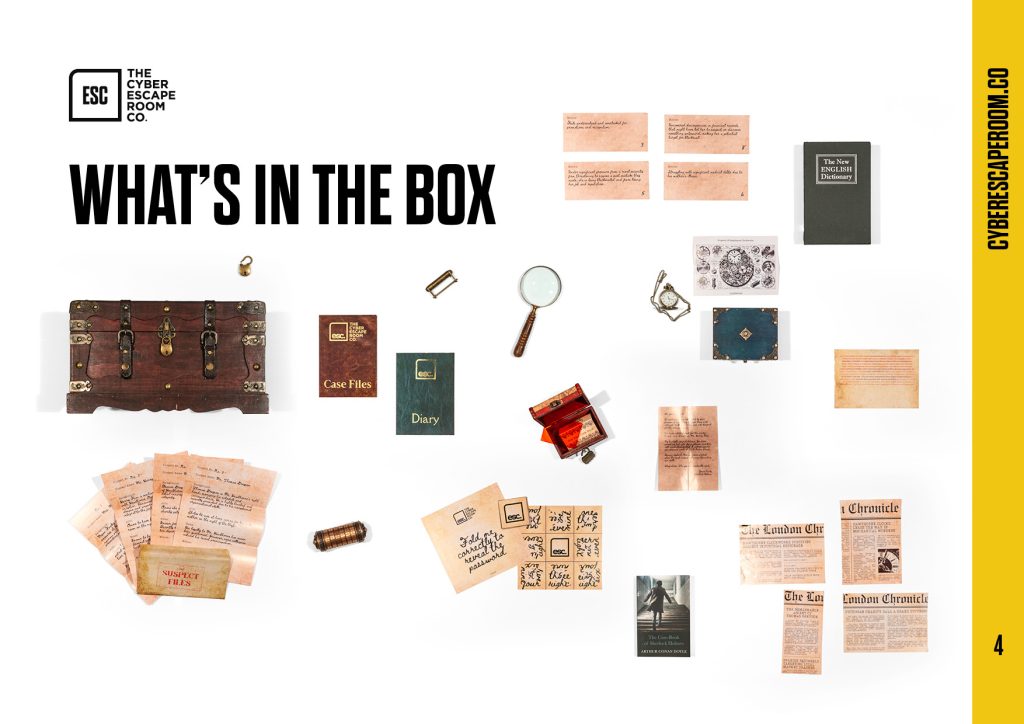
Sorting the photography while I was at it
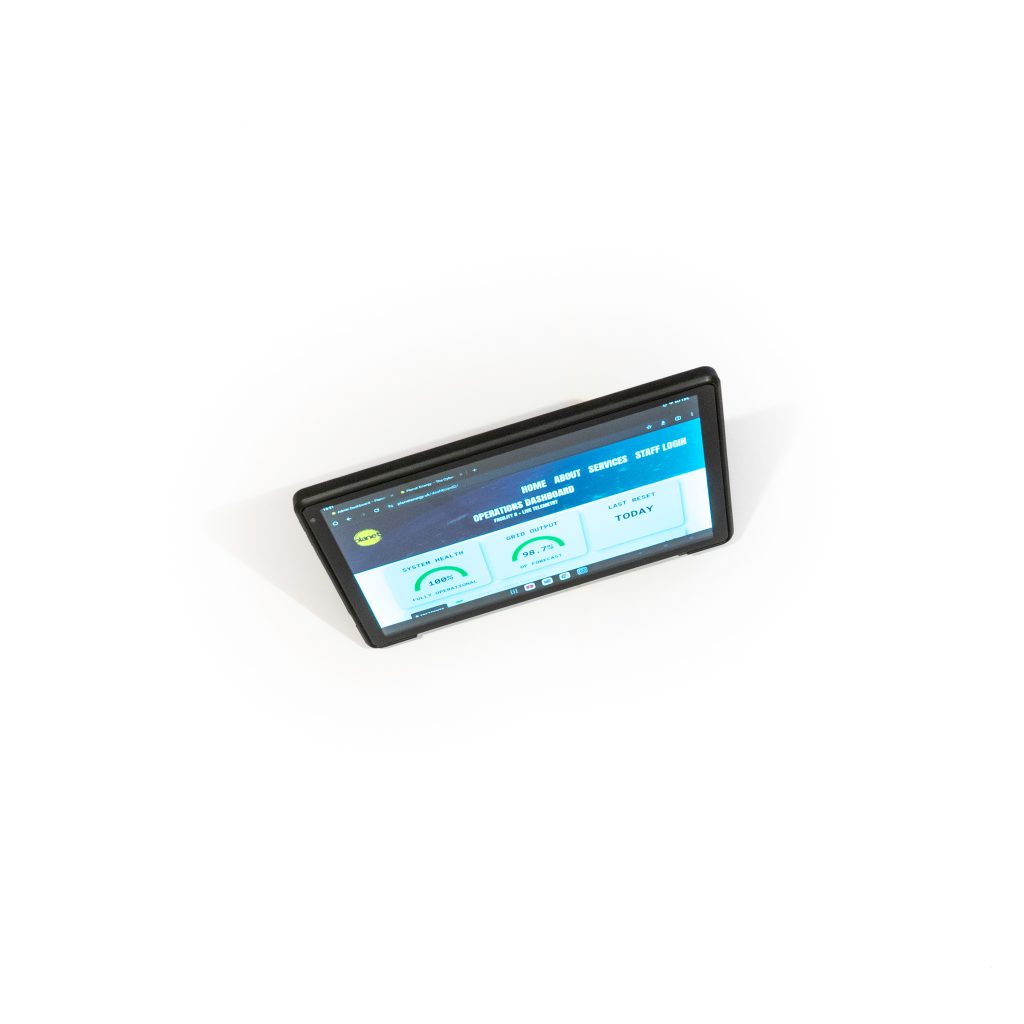
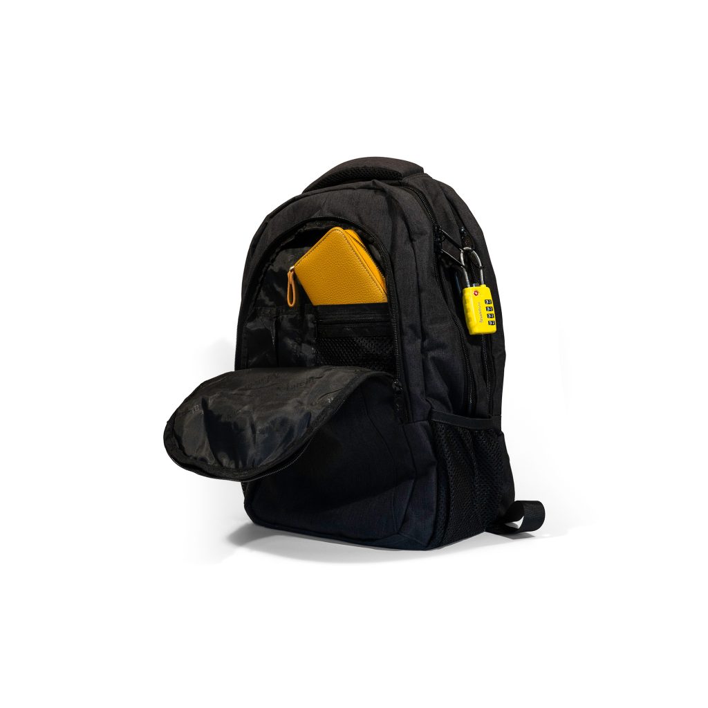
Before I started this role I knew that having studio photography of the physical cyber escape rooms for ESC would be hugely beneficial for my ideas going forward.
I’m not a photographer but with two studio lights, a tripod, backdrops, a Nikon and flashgun I got to work to get it done in a short space of time whilst also getting to familiarise myself with the games themselves which was great. I took shots of the games in full and also separate items. These photos went on to feature throughout the manuals so that people could see exactly what they’re looking at, as well as into the marketing material to show exactly what people would get for their teams to learn with and so many more places! Here are a few snippets.