
Overview
Jay and Jordi started Oatcakes & Milkshakes as a family business in Stone, Staffordshire. By the time they found me in 2017 they had the foundations of something really good, they just needed someone to make it look the part.
Nearly a decade later I’m still their designer. And in that time I’ve touched pretty much everything you see in the building: brand, menus, uniforms, screens, illustrations, posters, social content and reactive marketing that’s earned them worldwide press coverage and people travelling from across the country for a milkshake.
This is what a long-term design partnership actually looks like.
Together we’ve accomplished:
- A complete brand redesign creating an instantly recognisable look
- Evolved their printed menus to last longer saving materials and cost
- Constant ongoing marketing and brand collateral
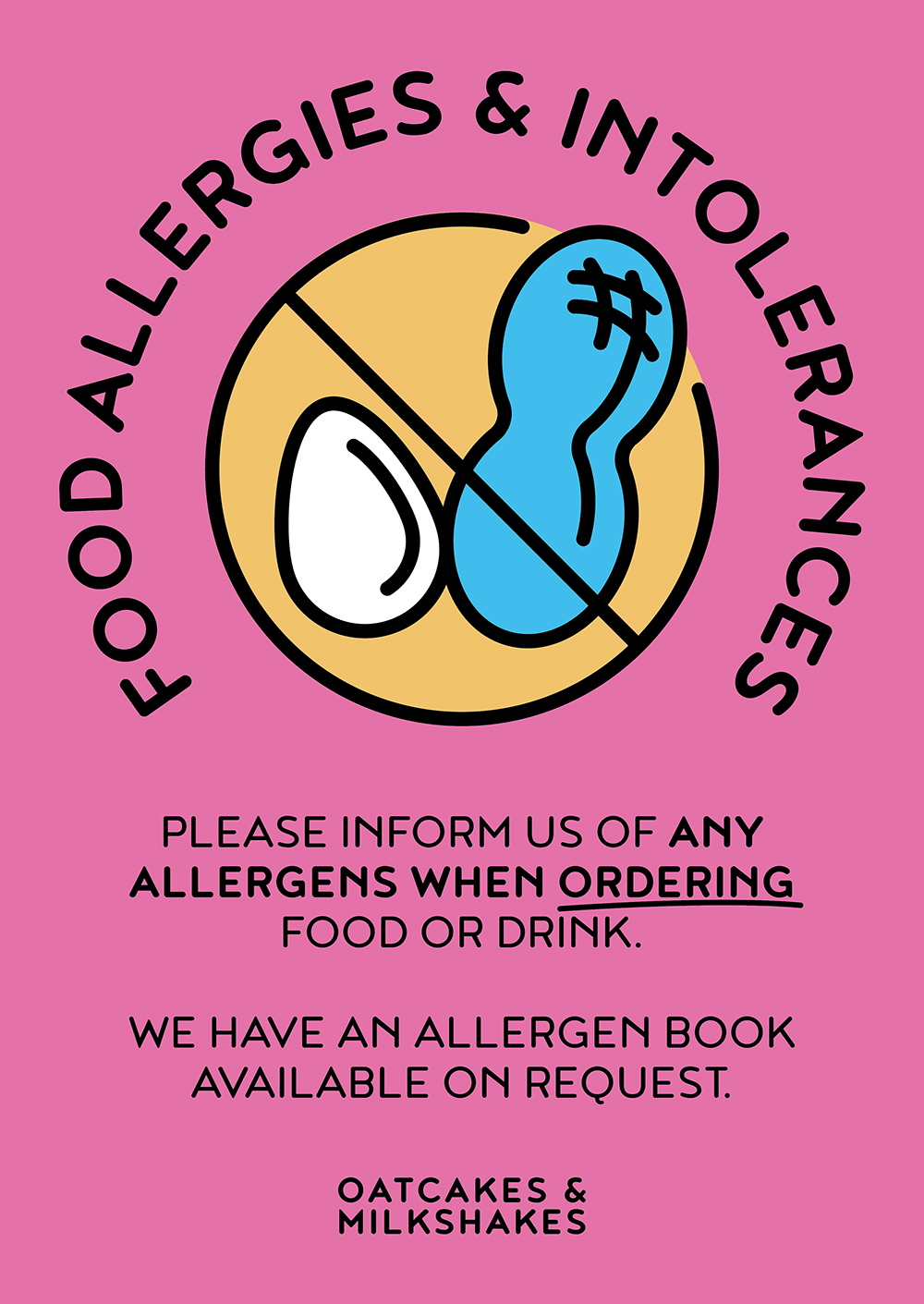
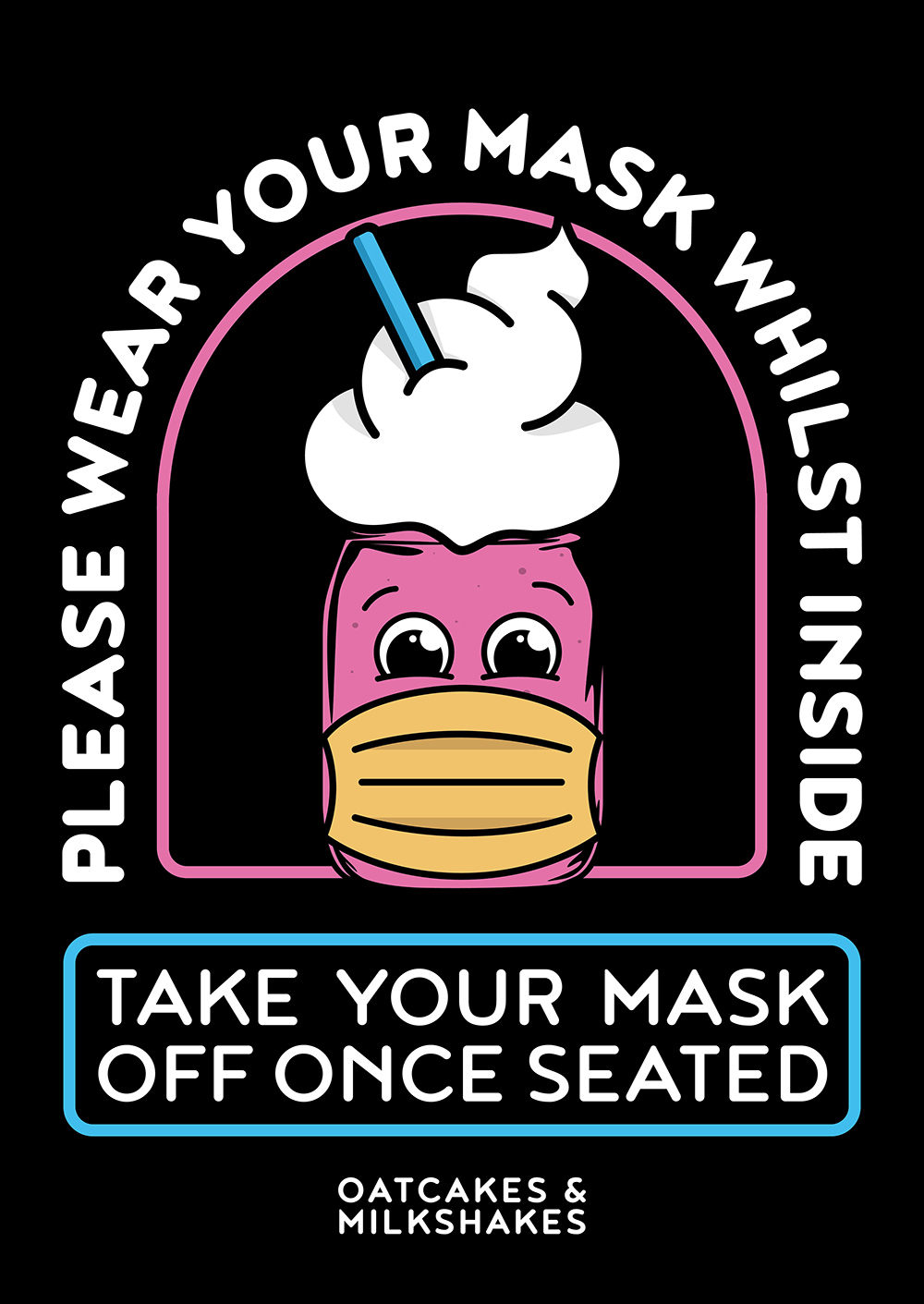
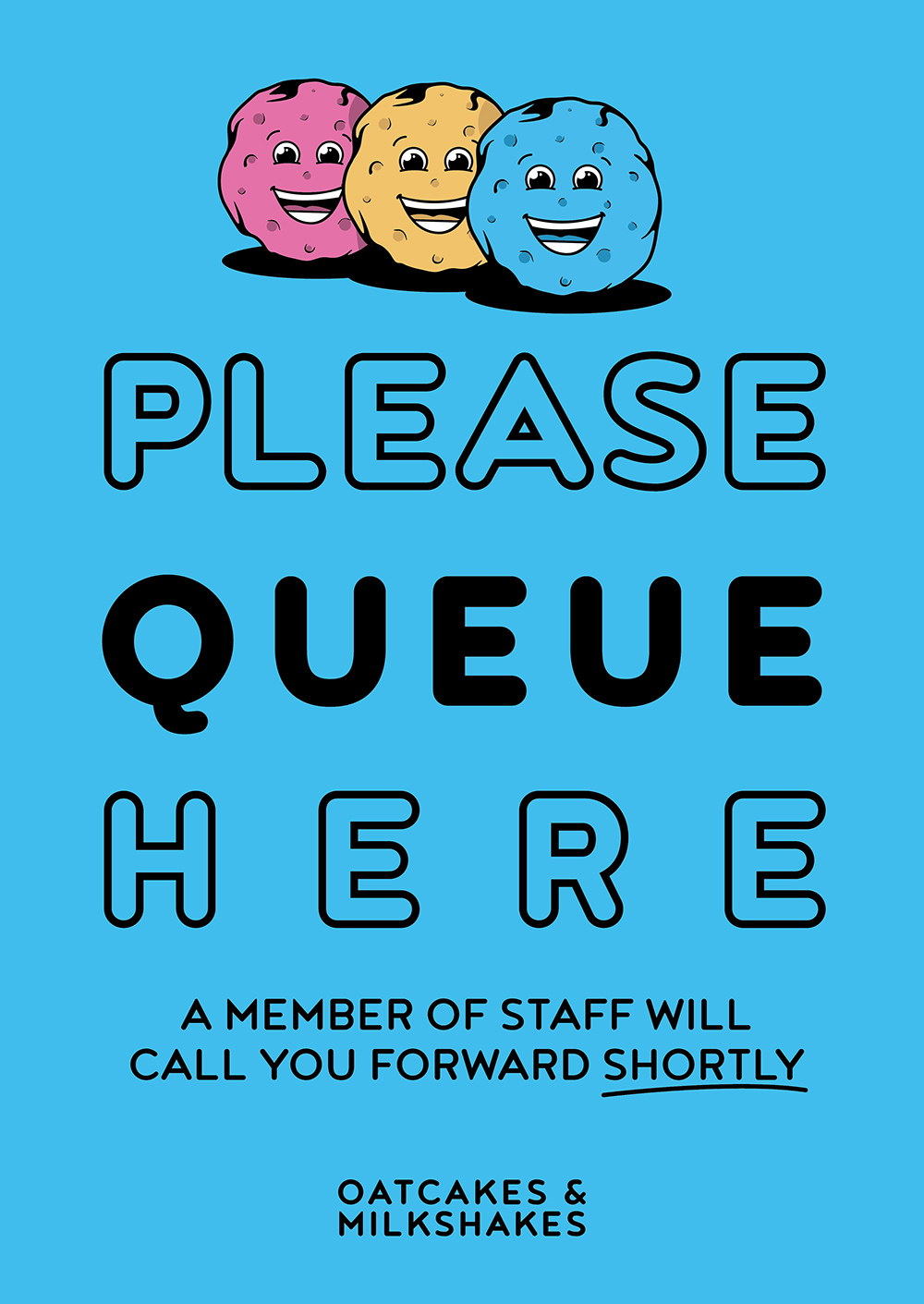
- Created COVID safe approaches so the business could continue to trade even during lockdown and acing the council inspection as the best they’ve ever seen with the help of clear and concise printed and digital material
- Ideation, recommendations and bringing the owners own ideas to life
What role have I played in this project? I work directly with the owners and handle all the design you see in this project (and beyond) plus all the print purchasing via my print partner.
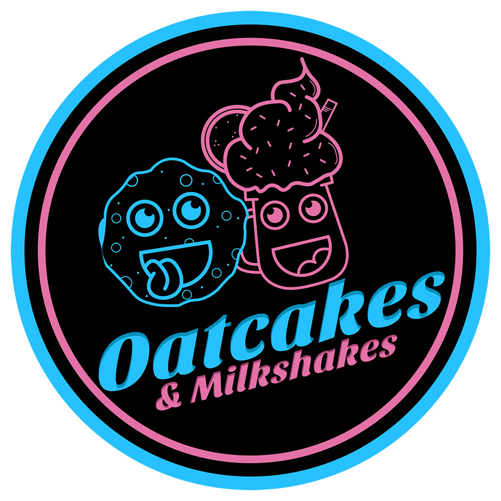
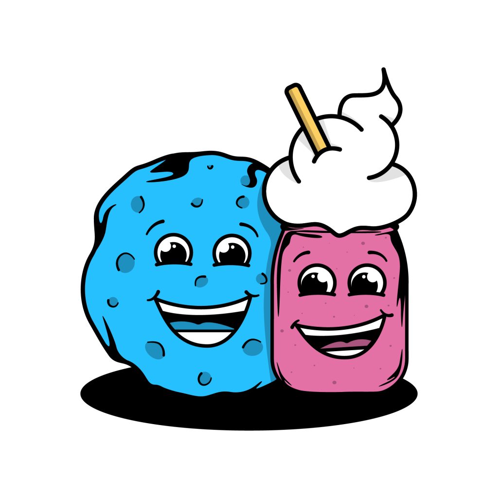
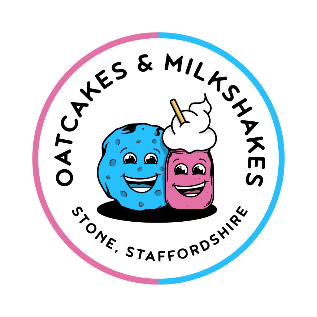
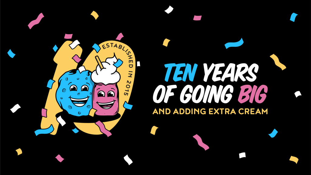
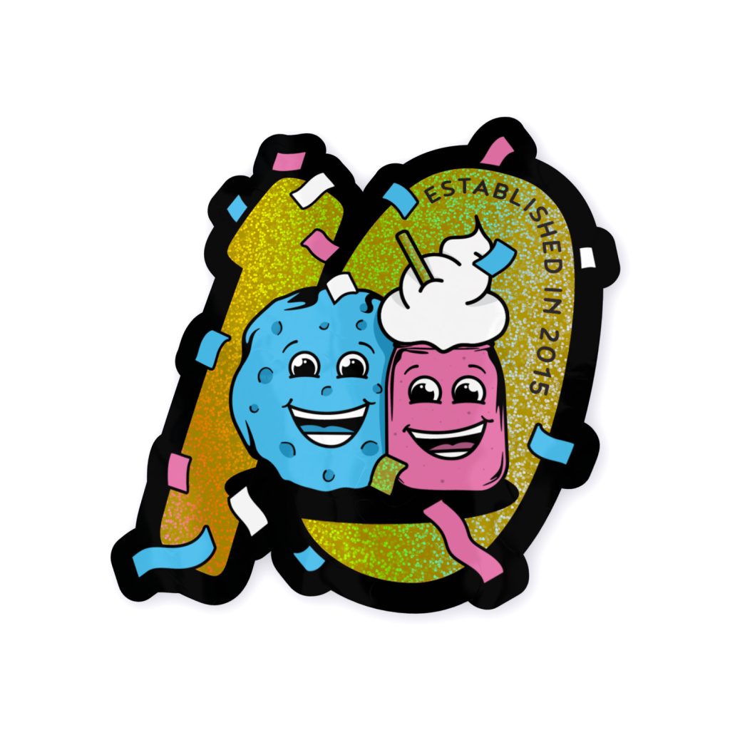
logo redesign
I liked the bones of what they had… so I redesigned it rather than starting from scratch. Made the characters bold, fun and unmistakably child-friendly, because that’s their audience and the logo should say so immediately.
Built as full vector so it’s future-proof and ready for anything, with variations for every application plus animated versions for video. It stands out a mile from the generic dessert businesses you walk past on every High Street.

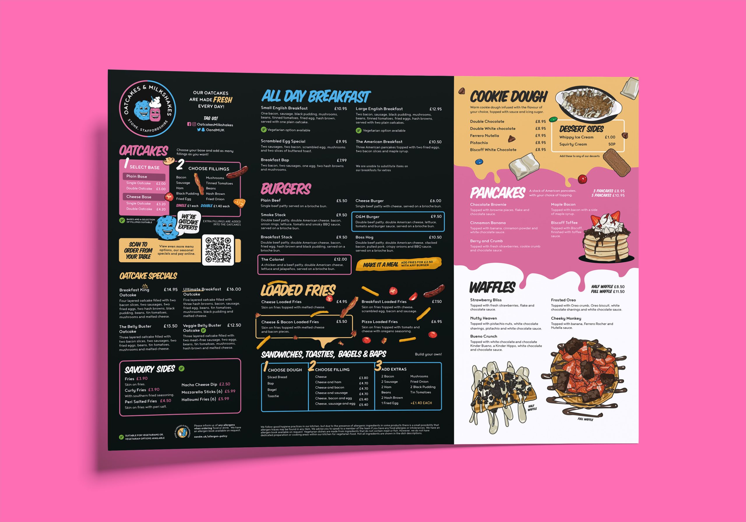
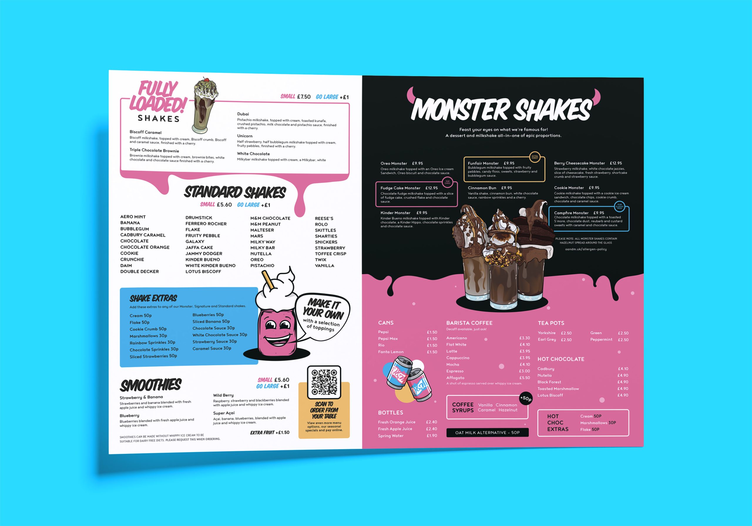
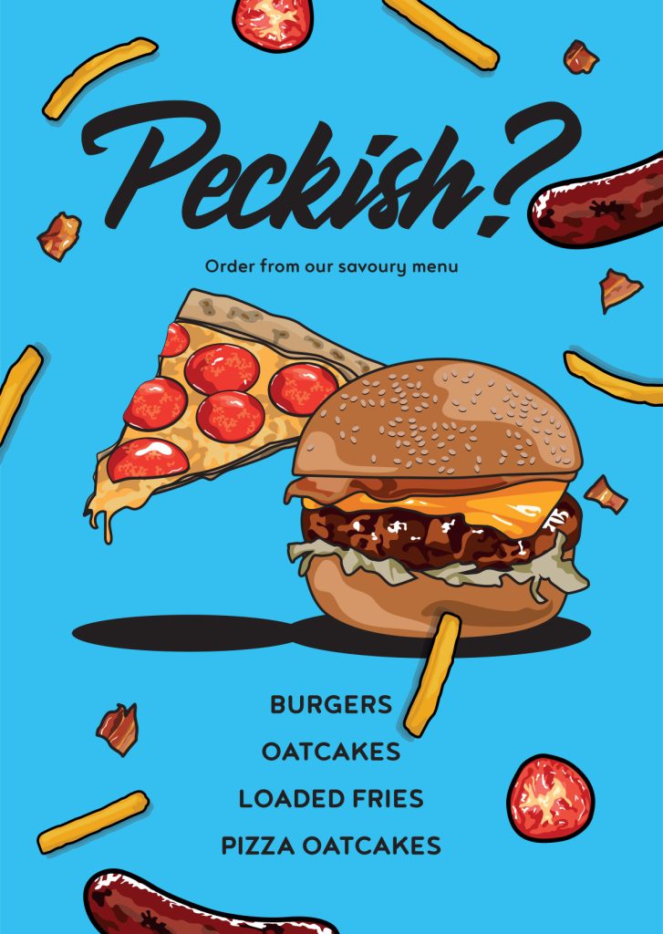
child-proof diner menus
Over the years I’ve created a lot of menus for O&M. Main menus, children’s menus, takeaway menus, digital menus, specials menus… currently they use a single main menu which is absolutely stacked with options. It’s like playing Tetris but I get everything in.
Children and menus don’t mix. They obliterate them. So I suggested we print on A3 tear-proof PVC, easy to wipe clean, lasts ages, saves a fortune. Because no one likes those petri dish, fuzzy edged, damp cardboard menus with the laminate that peels off, do they? 😬
animated screens
O&M has a welcome screen in the entrance and a huge screen in the main area. I create short motion pieces to welcome patrons, highlight specials, help people plan their order while they wait and promote delivery options.
They run on loop so they need to be eye catching, on brand and never boring. These are a few recent ones.
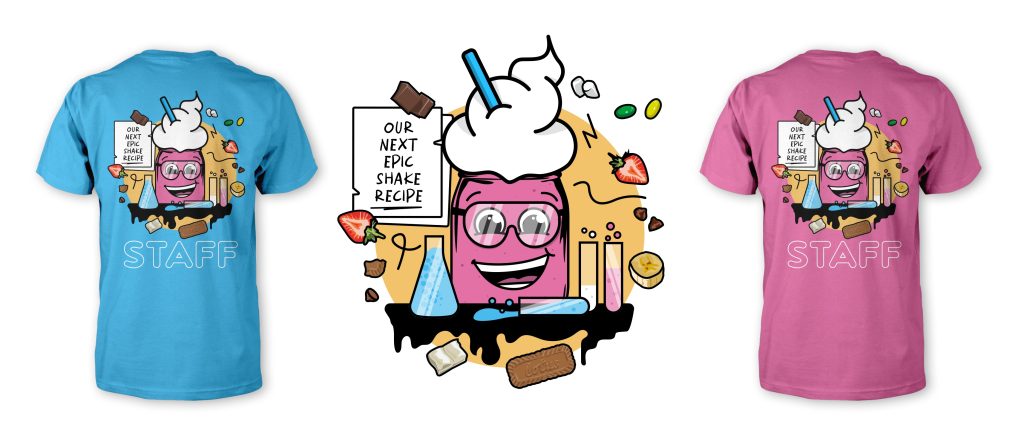
casual eye-catching uniforms
The O&M team are easy to spot. Branded tees, relaxed feel, unmistakably them. Business in the front, party in the back. The back print is the real showstopper.
The uniforms have even made the international news, O&M featured in a Ruptly global news story, with the tees front and centre. Not bad for a diner in Stone.


social creative
Organic static and motion posts to highlight menu items, manage delivery demand, promote offers and keep their followers engaged. O&M have a really active, loyal following… the content has to match that energy.

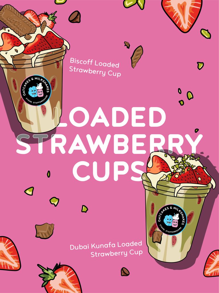
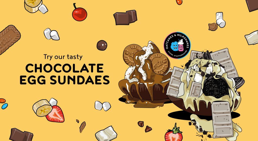
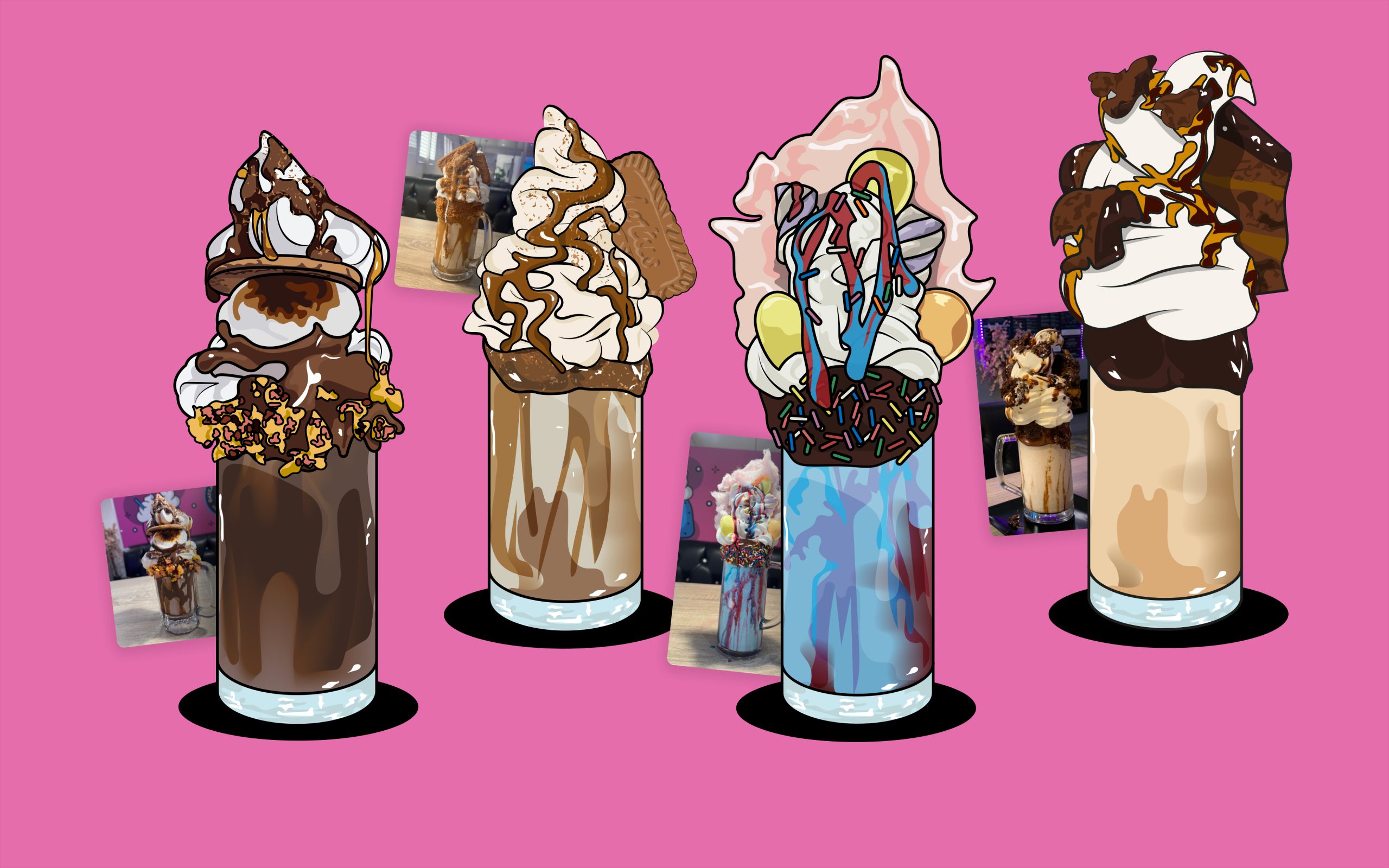
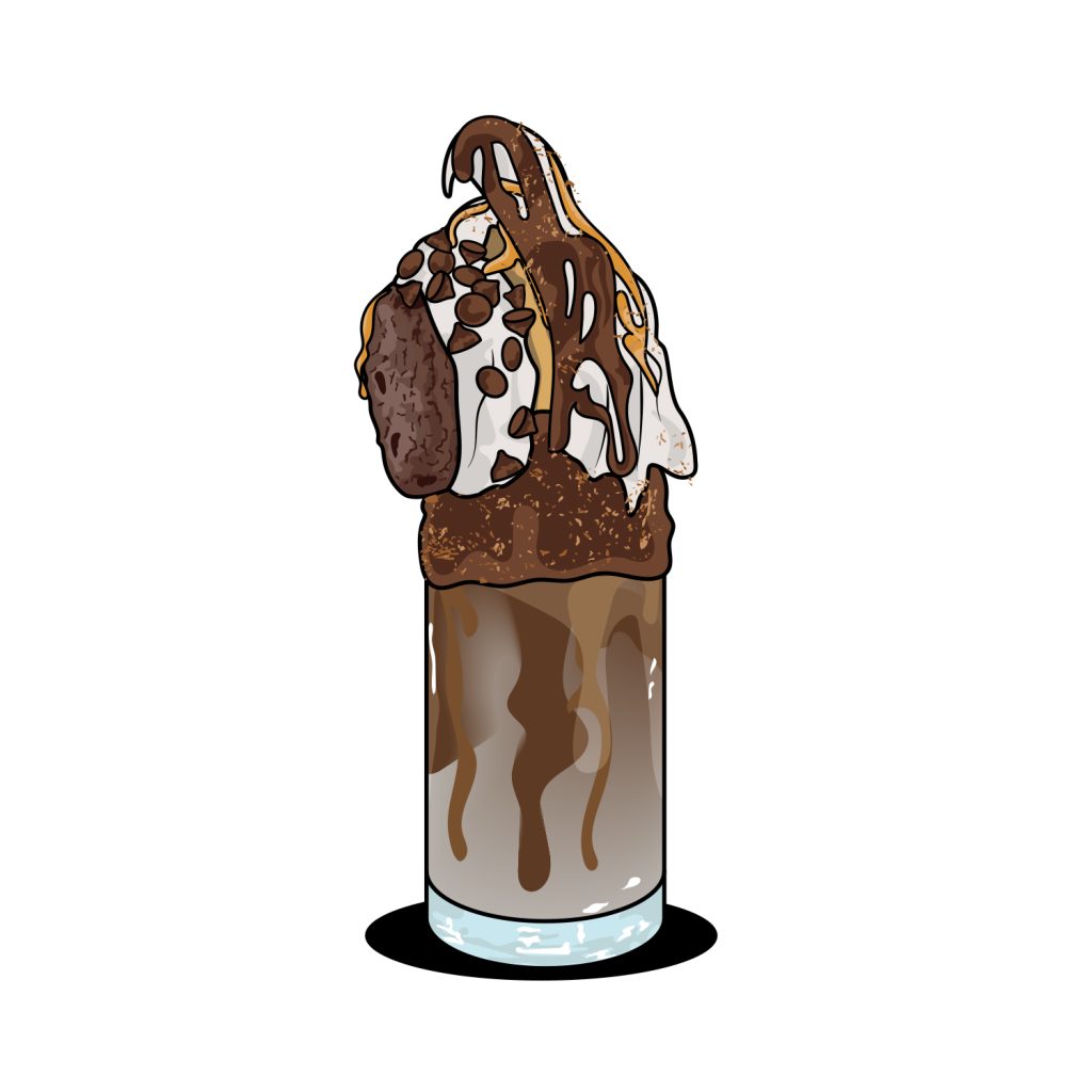
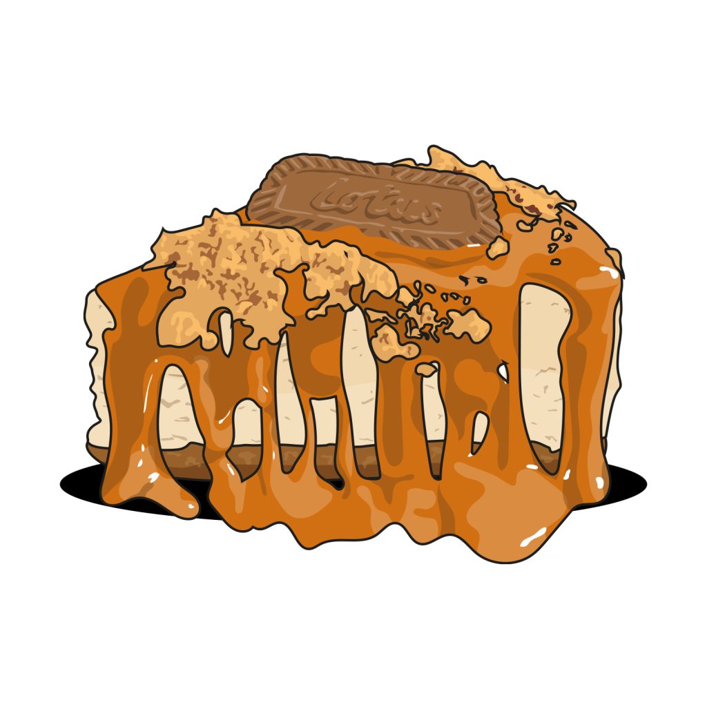
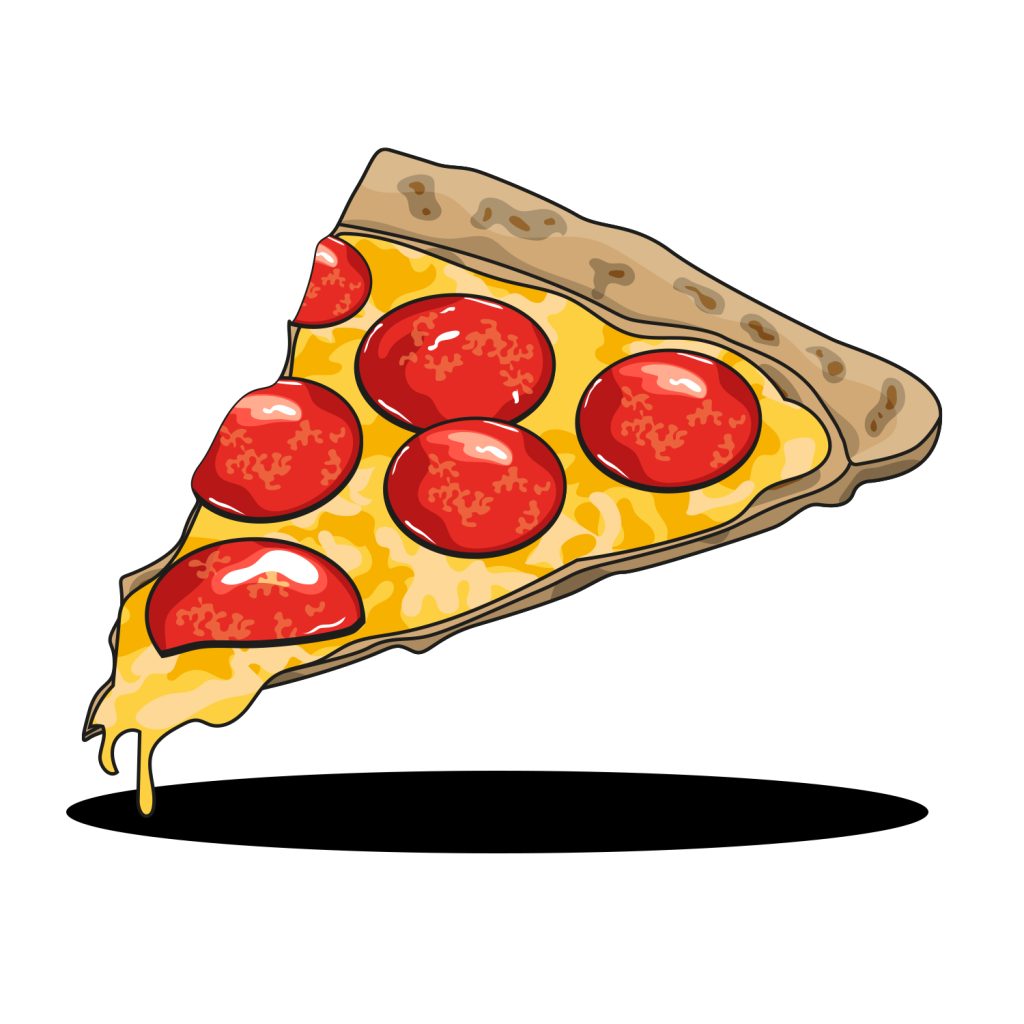
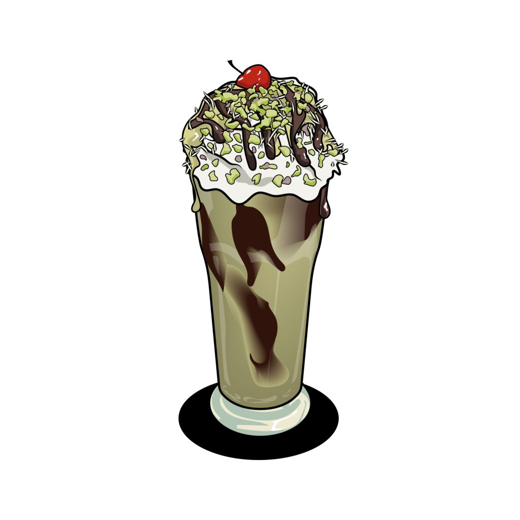
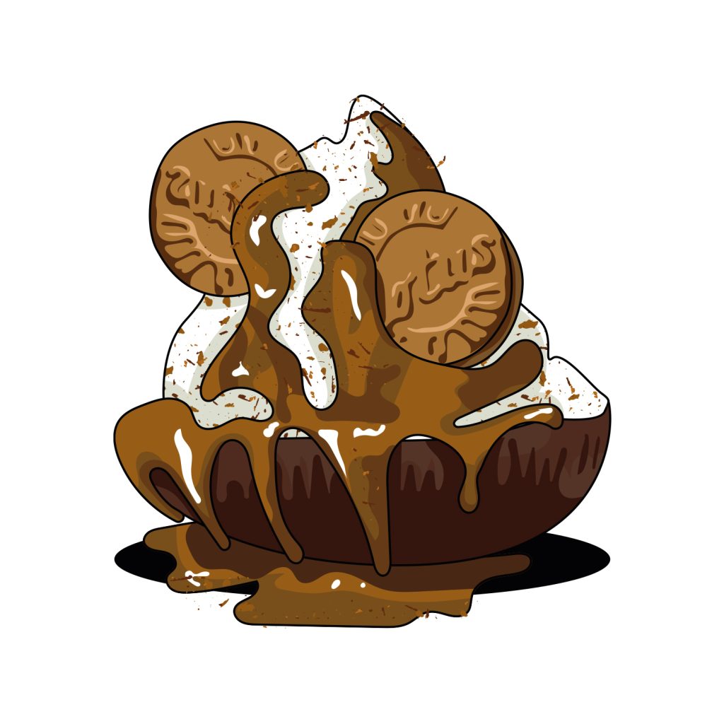
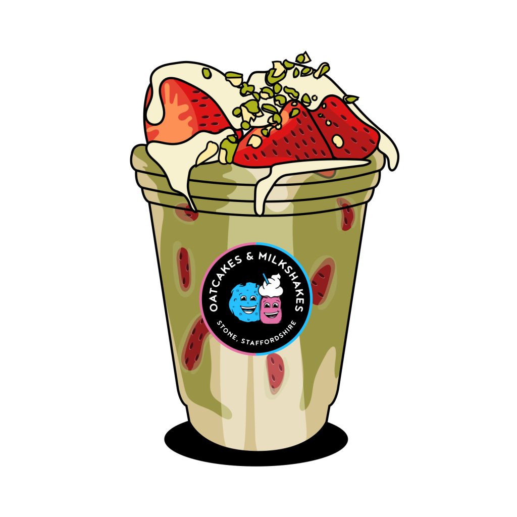
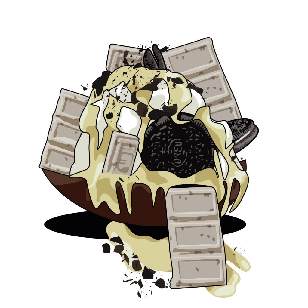
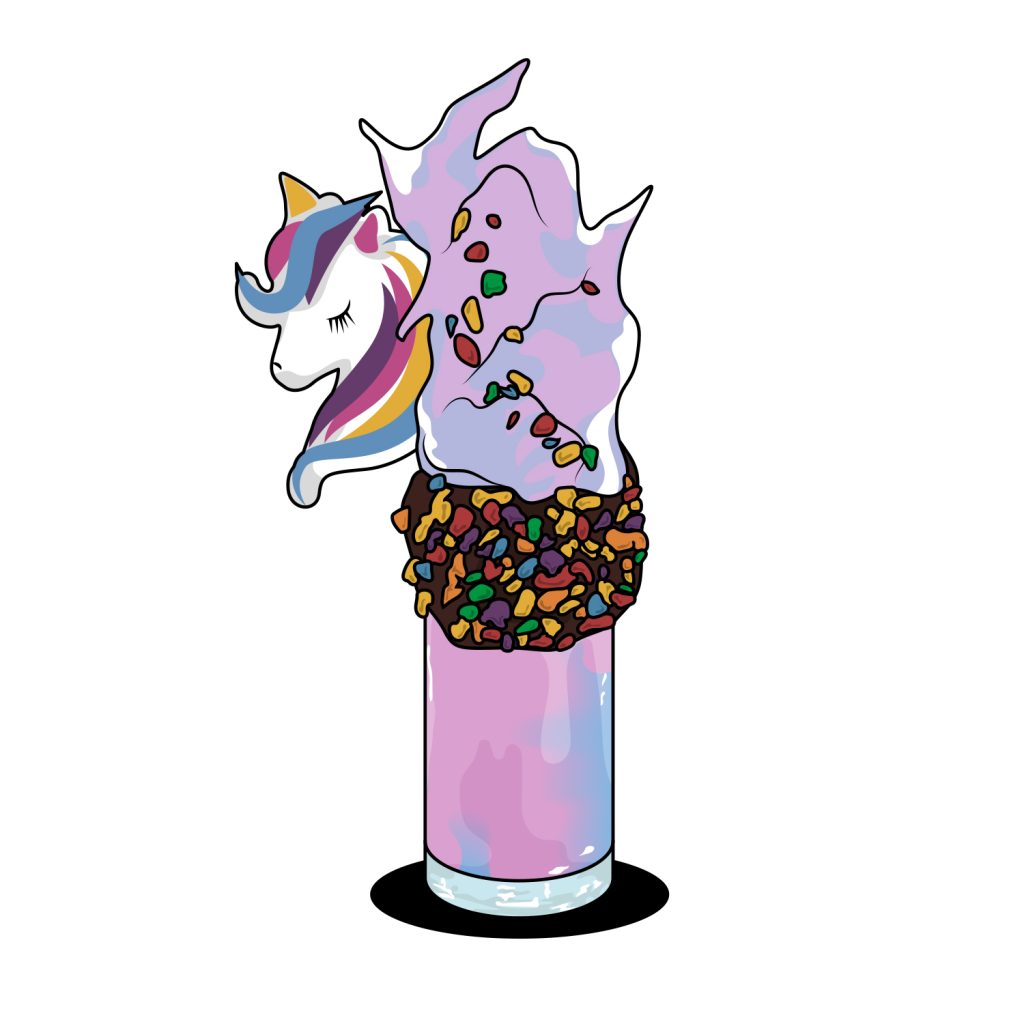
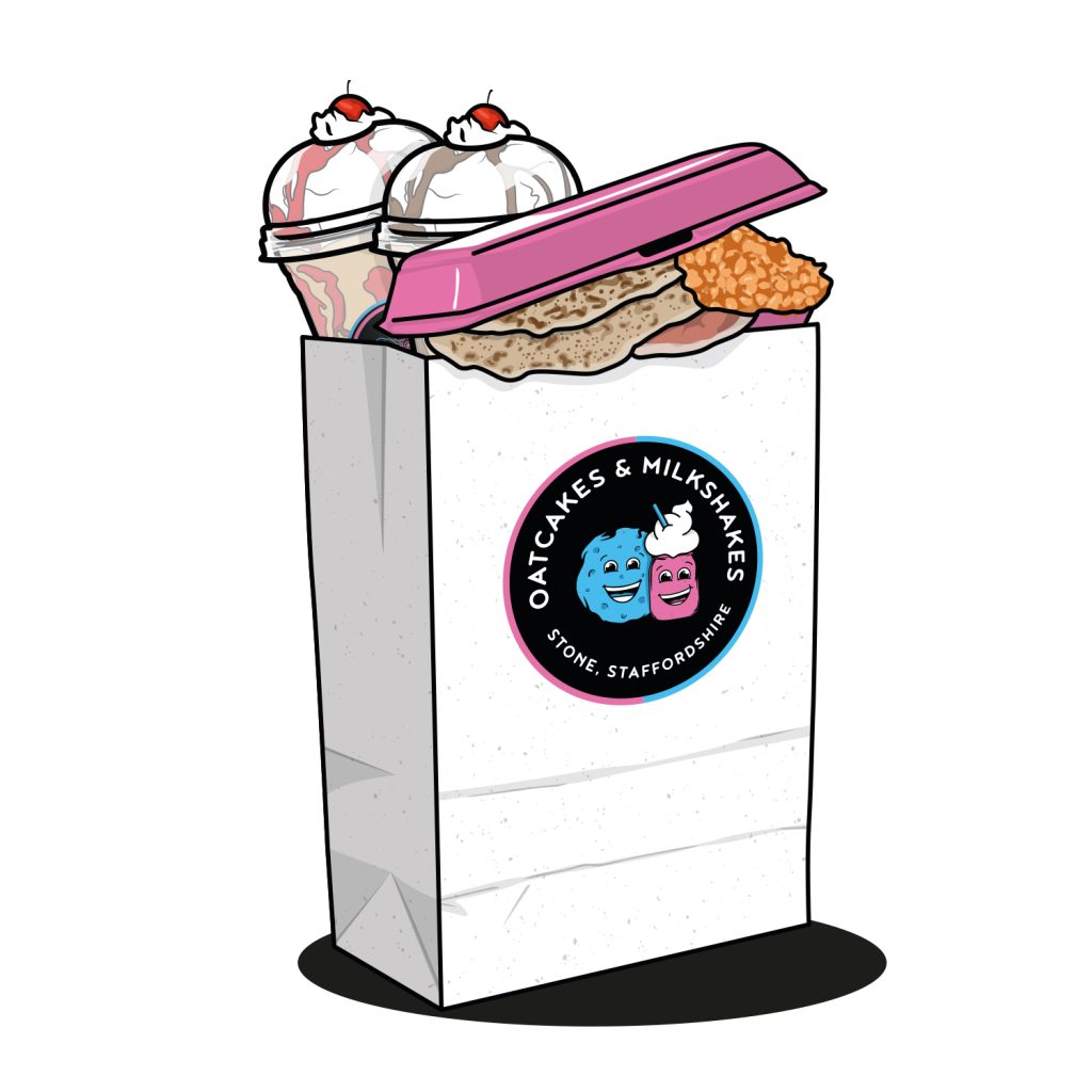
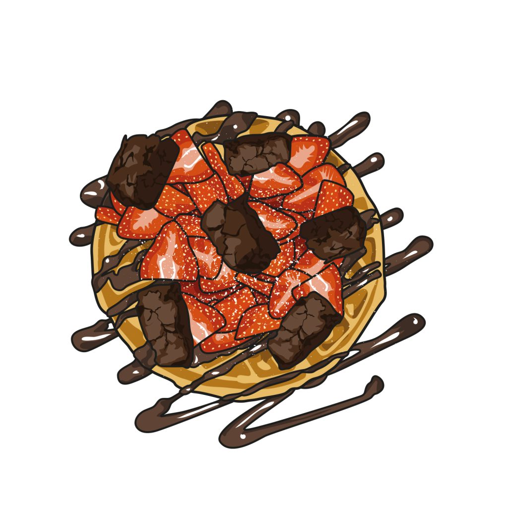
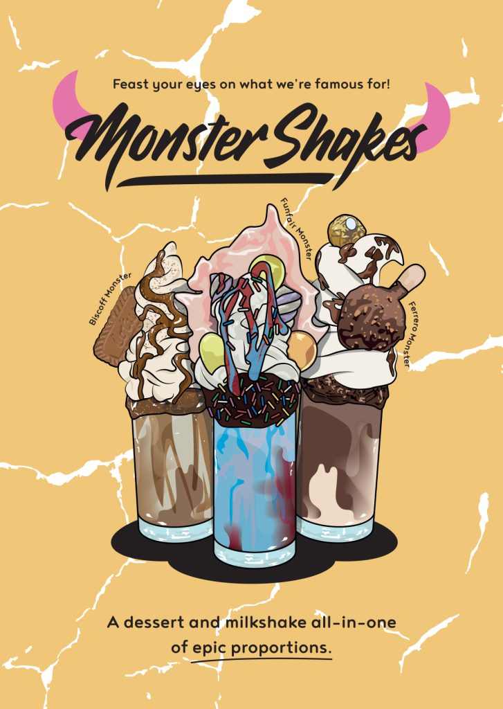
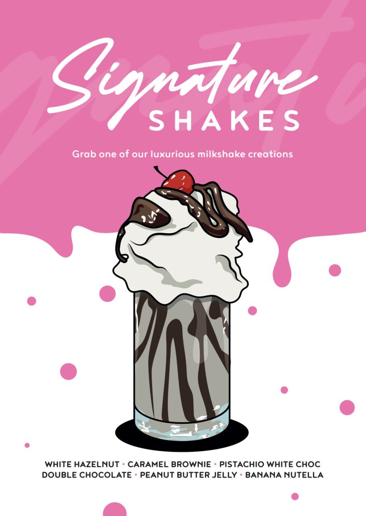
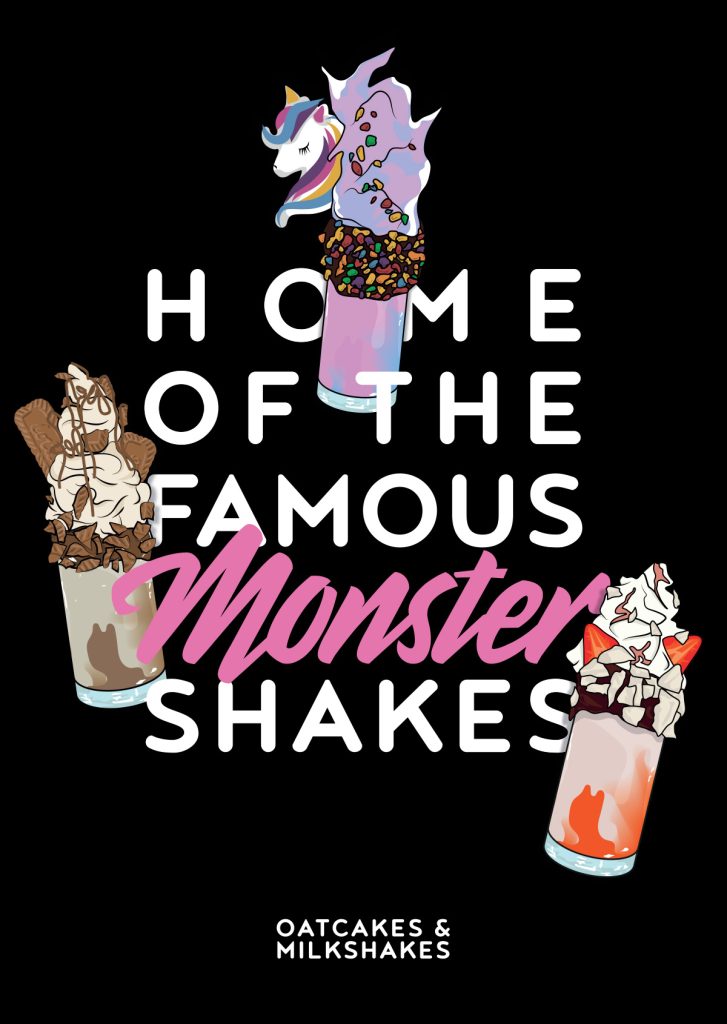
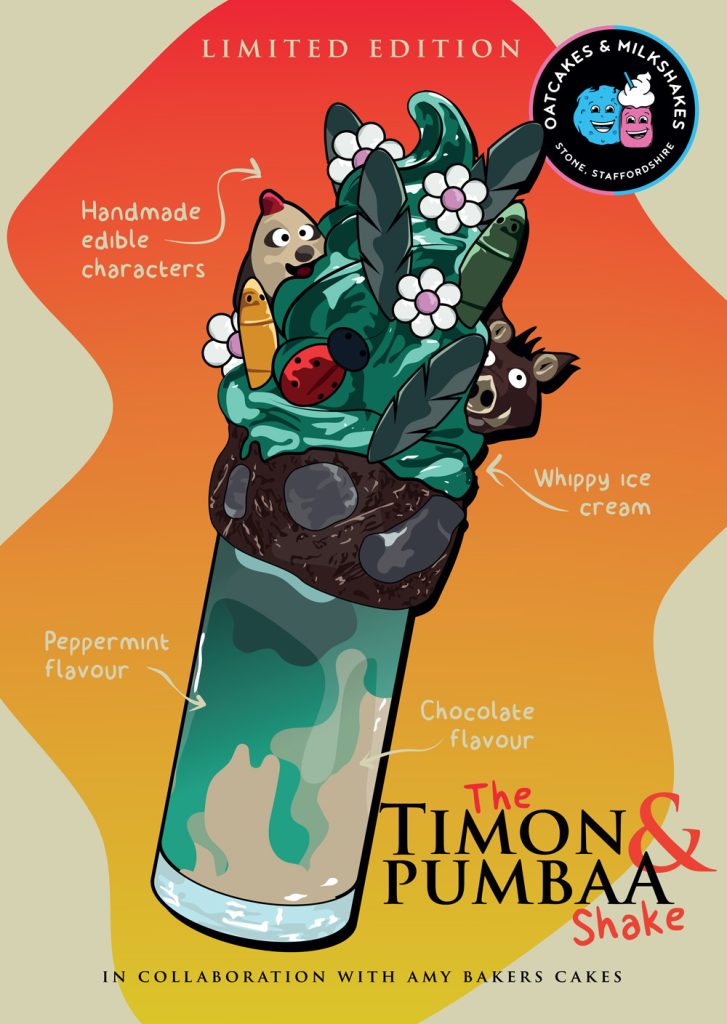
faithful + fun illustrations
I’ve created countless illustrations of their incredible shake line ups over the years. These have been used on the menus, promotional material, social media, clothing, their website and more.
These illustrations are faithful, you will get an entire slice of cake or unicorn head on that shake!
These have been used on menus, promo material, social, clothing, the website… everywhere, basically. A new shake joins the lineup? It gets its illustration.
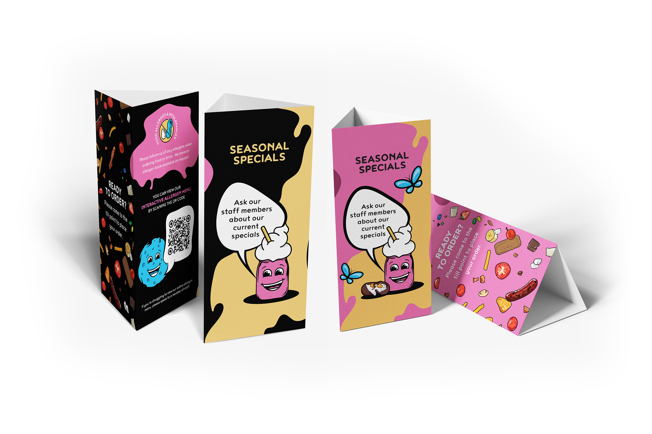
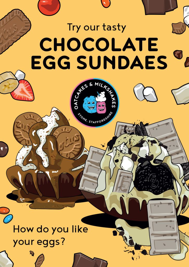
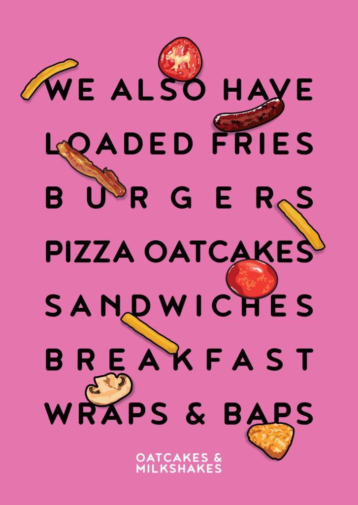
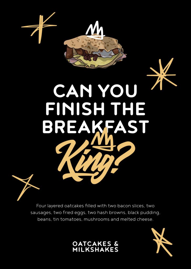
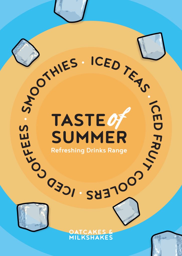
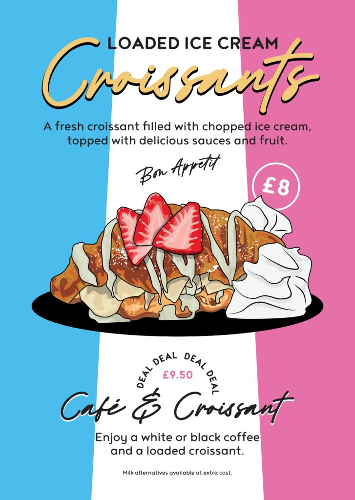
posters… posters… posters!
The premises has several poster spots, inside and outside, A1 to A4. We keep them all filled.
I maximise print budgets by using double-sided printing on A4 and A3 posters so the owners can flip them as and when needed. Two posters for the price of one. Every time. And I handle all the print purchasing so all Jay has to do is approve the artwork and accept the delivery.
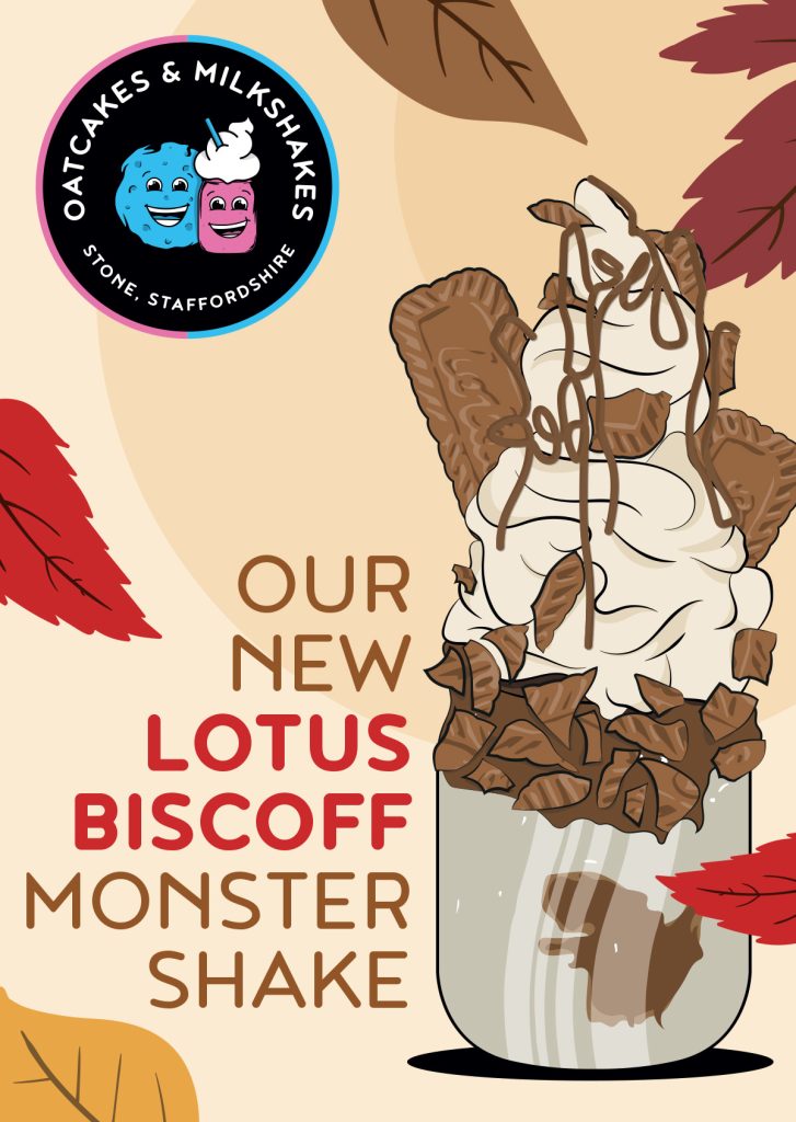
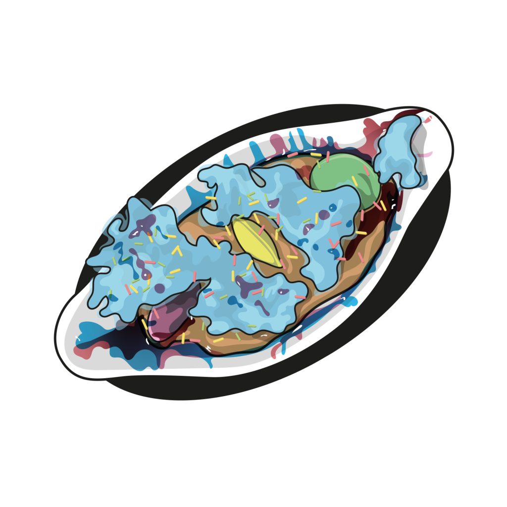
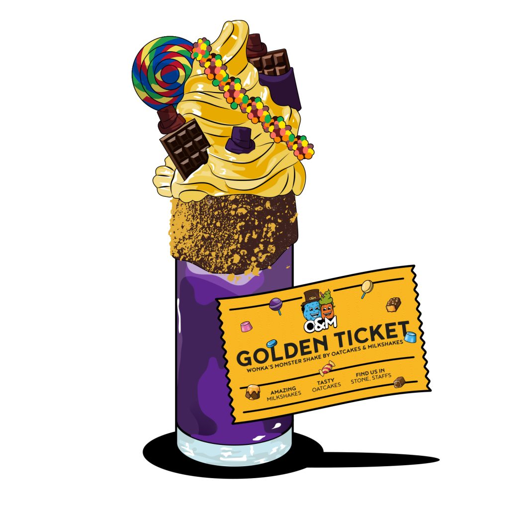
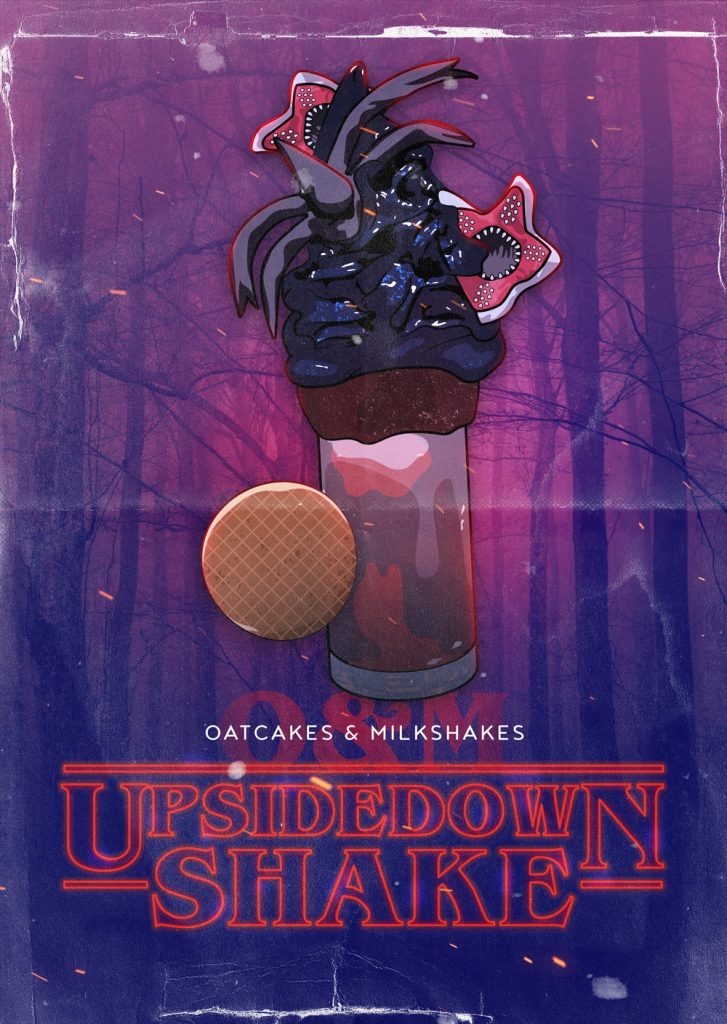
reactive shakes + marketing
Jay and Jordi are always up for reactive marketing — jumping on trends before anyone else locally has thought about it. Several of their pop culture shakes have gone genuinely viral over the years, with people travelling from hours away just to try them. From Kalani Ghost Hunter from Nashville to Potter fans worldwide.
I keep the illustrated style and O&M colour scheme consistent so every special feels like it belongs to the brand rather than being a random one-off. Reactive doesn’t have to mean off-brand.
Several of the shakes based on pop culture have gone viral over the years, with people traveling far and wide to give them a go! I keep the illustrated feel and the O&M colour scheme whilst working it into the promo for the special shakes.


covid changes to continue business
When the pandemic hit, O&M needed to move fast. I helped them communicate the changes clearly to customers. From shifting focus to takeaways and delivery, to reassuring people when the doors reopened.
The result? Five star hygiene inspections, with one council inspector calling it the best setup they’d ever seen. The clear printed and digital material played a big part in that.
Several of the changes we implemented during that period are still in place today: the booth separation, the QR ordering, the allergy information posters.