
Nailed Up is a clothing line from the owner of Bullshift, the motorcycle brand I already work with. We’ve been working together for 10 years.
It’s grungy biker style with scripture running all the way through it. Crown of thorns, lightning, a flag made of claw marks… not quite what you’d find on the merch table at a church fete 😄
It started as a list of Bible references and a lot of enthusiasm. My job was to turn them into a logo, a run of tees and a shop page that sits on his existing site without looking like it wandered in from the motorcycle side.
What role do I play in this project? I’m the sole designer. I worked directly with the owner, who came to me with the scripture, the themes and the story behind each design. I did the logo, six tee designs, the hem tag, the neck print and the Shopify pages.
The logo: three nails, one triangle
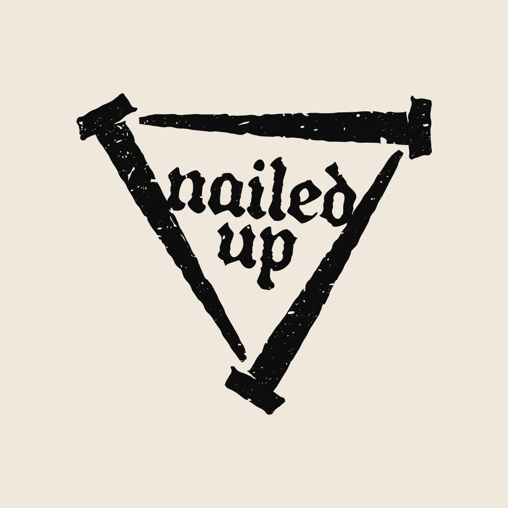
Three crucifixion nails in a triangle. Playing on the reference of three from the Bible and avoiding what is quite possibly the strongest logo in history – the cross.
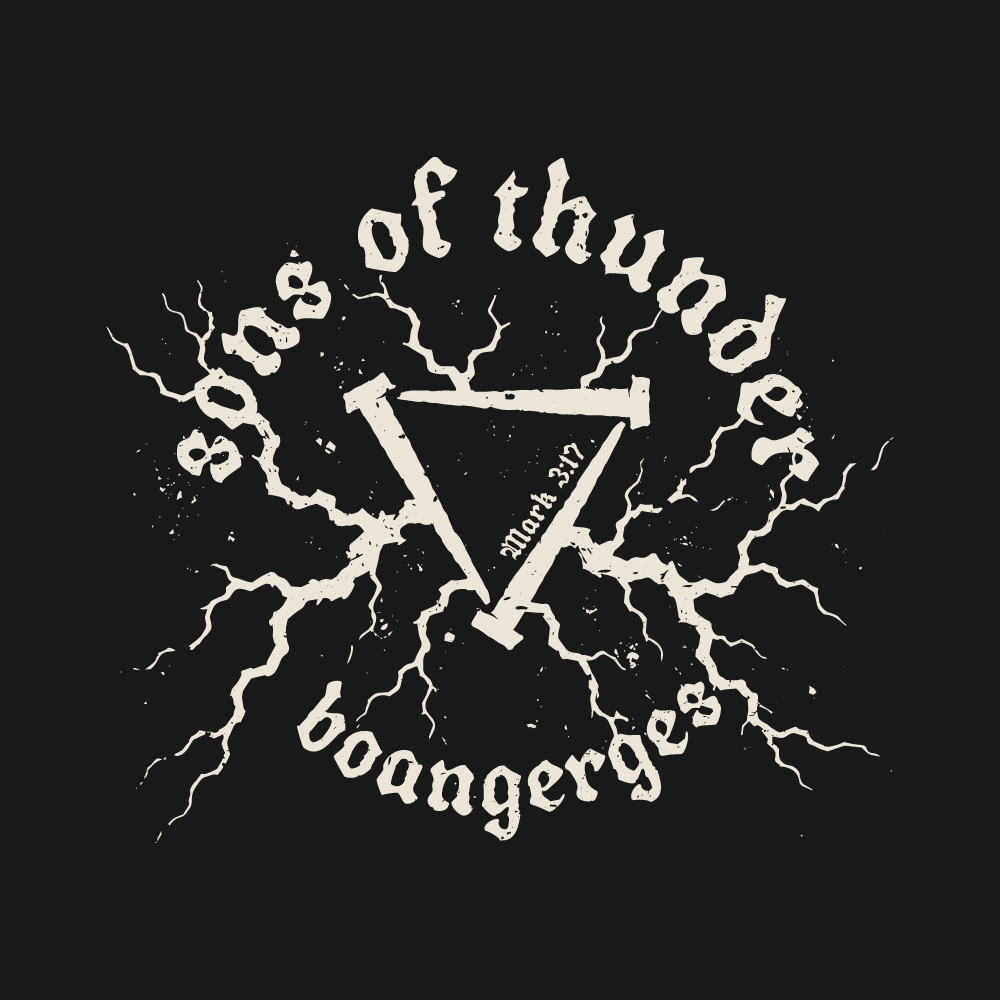
Simple, so it works small on a hem tag and big in the middle of a back print. It also turns up inside the designs themselves. In Sons of Thunder it sits upside down in the centre with lightning cracking out of it.



Colour palette
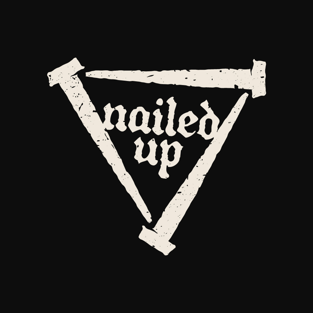
The limited colour palette is inspired by The Bible and the years it spans.
The off-white is reminiscent of the paper of The Bible and also the simple cotton they wore. The red symbolises the blood of Christ. The dark charcoal is a nod to the grungy biker twist to this merch.

Six tees, one system
Every design is an off-white screen print on a charcoal tee, with red brought in for the loudness. There’s a big back and chest prints. The logo often appears as a small chest print sitting low on the ribs, right where the spear went in. That one was the client’s idea, and it’s on every tee so the range reads as a family.
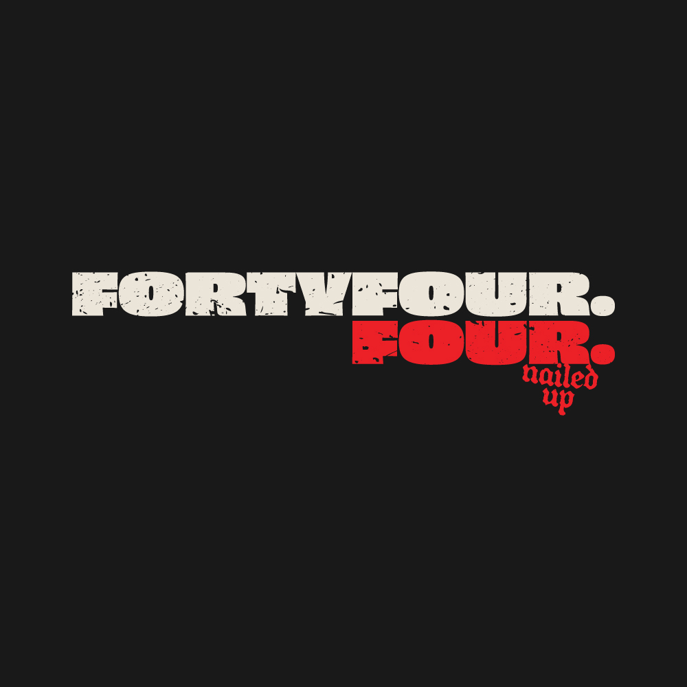
I chose Obviously Wide Super and attacked it with a grungy treatment to do a lot of the heavywork. Bladfour Inkbleed, a blackletter, is saved for anything with scripture attached. If we had a Venn diagram of Scripture and Biker, Blackletter would sit in the middle – got to be done!
Crown of Thorns
The busiest one. A crown of thorns wraps round the nail triangle with fire rising through the middle. Twelve bars stand in for the twelve apostles, and Luke 23:42 and John 3:16 are tucked into the artwork.


Sons of thunder
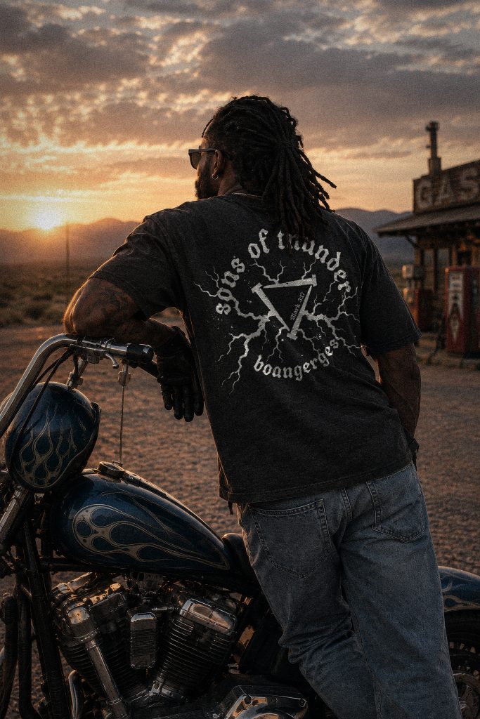
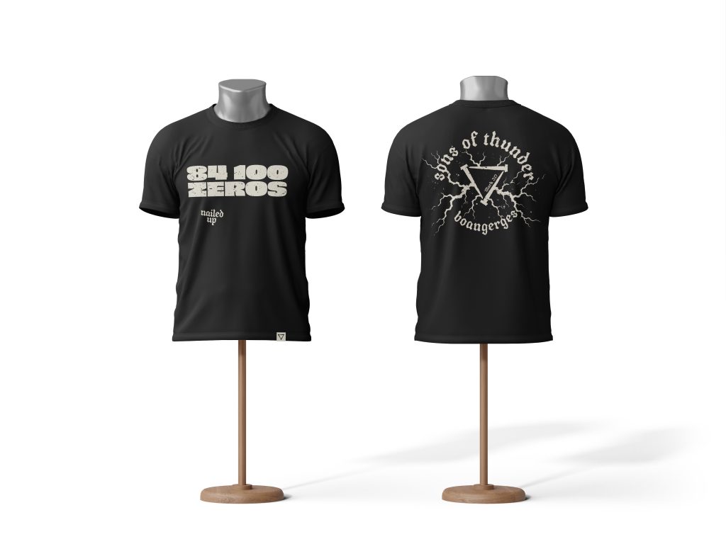
Boanerges is the nickname Jesus gave the brothers James and John in Mark 3:17. It means Sons of Thunder, so… lightning. The lettering curves round the nail triangle, with Mark 3:17 set inside it.
Blood soaked son of man
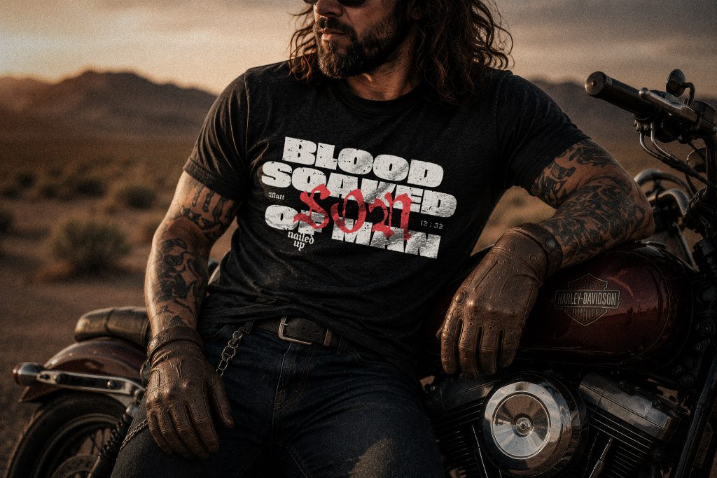
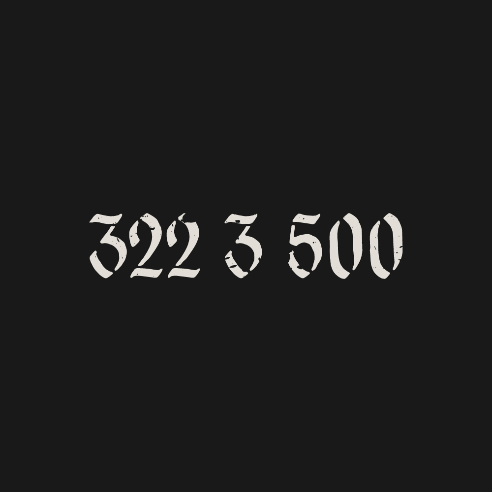
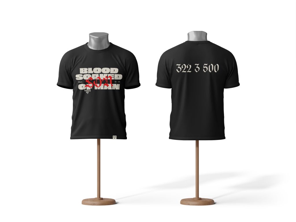
Big chunky type, Matthew 12:32 either side of the middle line and a red scrawl bleeding through it. The back print is 322 3 500, the client’s shorthand for 322 prophecies, three predictions of his own death and 500+ witnesses. It looks like a lottery ticket until someone explains it.

Scars + Stripes
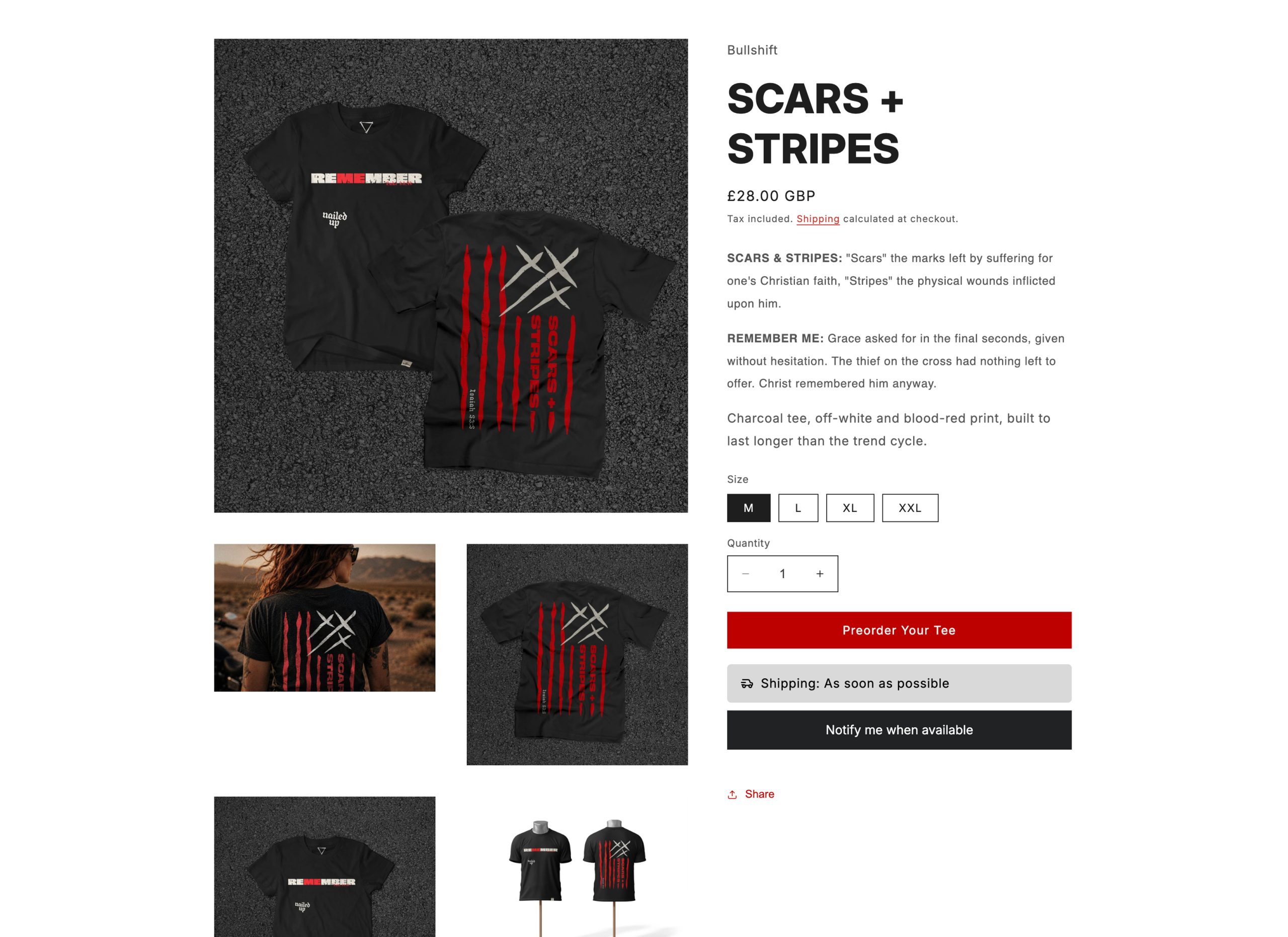
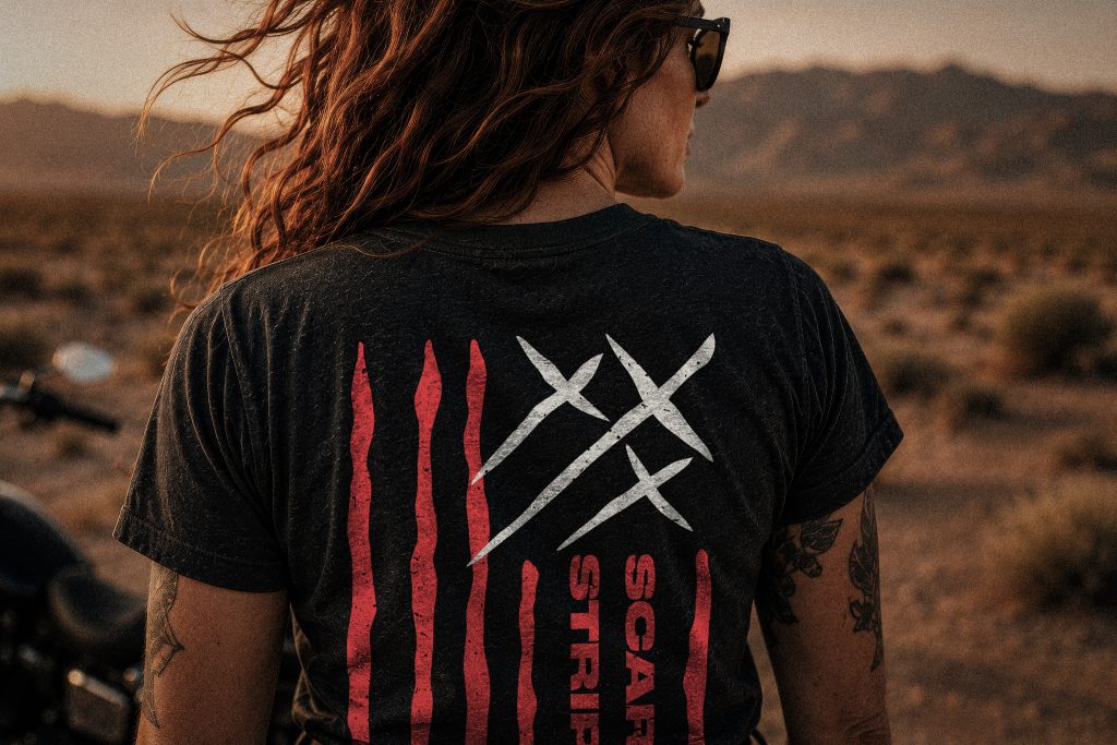
The stars and stripes rebuilt as claw marks, with scratched crosses where the stars should be. “Stripes” is the old word for scourge marks, so the Isaiah 53:5 verse (“with his stripes we are healed”) sits on the front as IS 53:5. The back says REMEMBER with Luke 23:42 underneath, the thief on the cross asking to be remembered, and the ME picked out in red.


Written code – paid
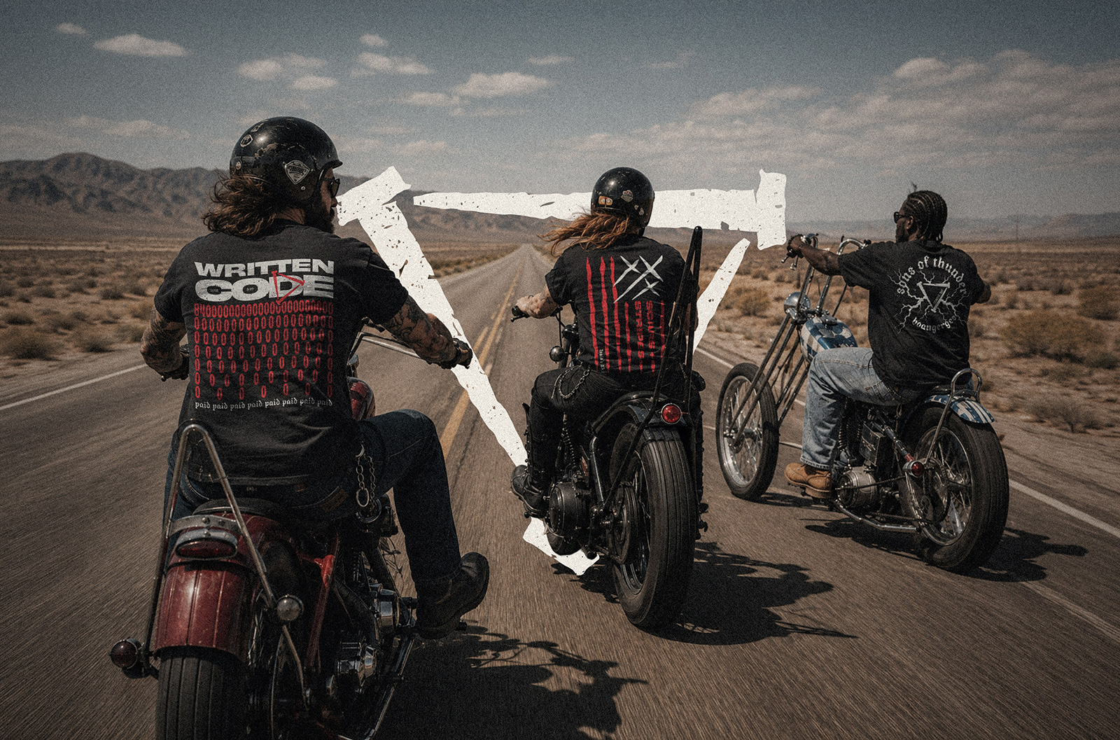
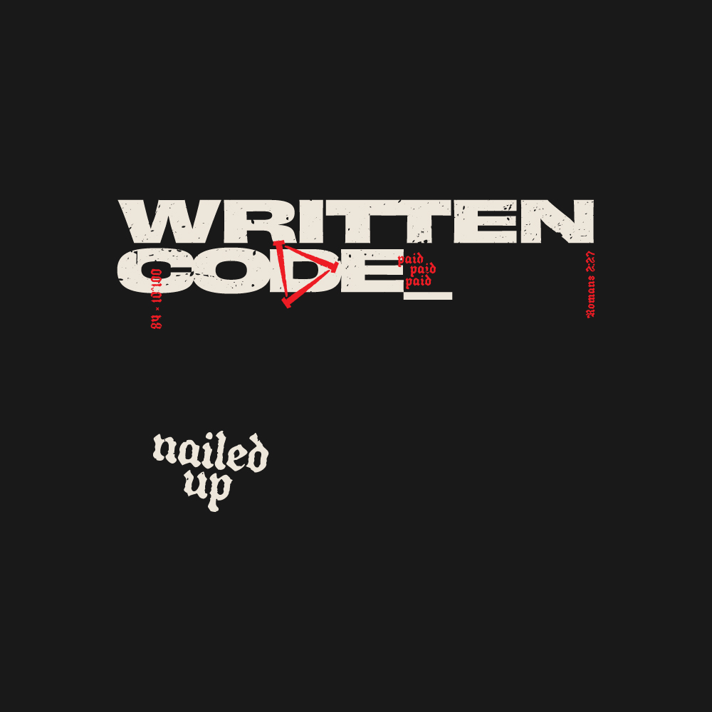
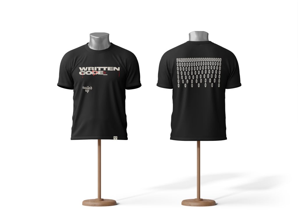
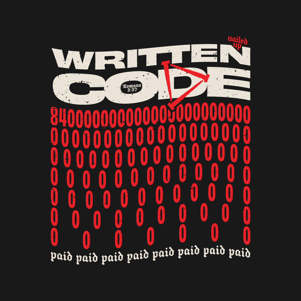
Riders have an unwritten code… the nod, the wave, the “you alright?” at the side of the road. Written Code swaps it for a spiritual one. The name comes from Romans 2:27, and the client’s twist is Jesus’ new covenant marked “paid”, safe passage past a vicious enemy.
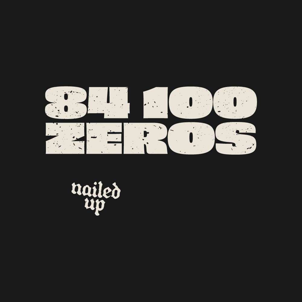
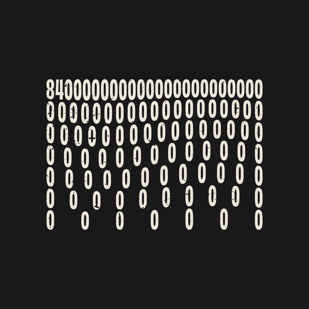
The big number is “84 100 ZEROS”, the client’s shorthand for the odds against 322 Messiah prophecies all landing on one person. It’s the most cryptic of the six, so the product page does the explaining and the tee gets people asking.
written code – heisiam
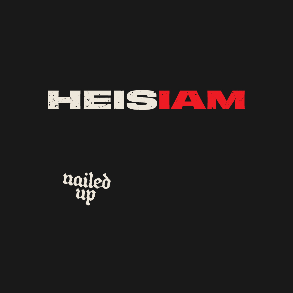
The second version adds HEISIAM, “He is I AM”, from Jesus’ line in John 8:58, which echoes God’s name at the burning bush in Exodus 3:14. Say it quickly the way the client does and it sounds like “Messiah”. No verse on this one, because the wordplay does the job.

Hem tag + neck print
The hem tag is to be in a natural textured cotton to contrast the charcoal tee’s, with the simple logomark embodied onto it. This will sit at the bottom right of the t-shirts, which adds a premium touch to the release.
The good quality blank tee’s are to be de-tagged and replaced with a screen printed neck print for further branding.
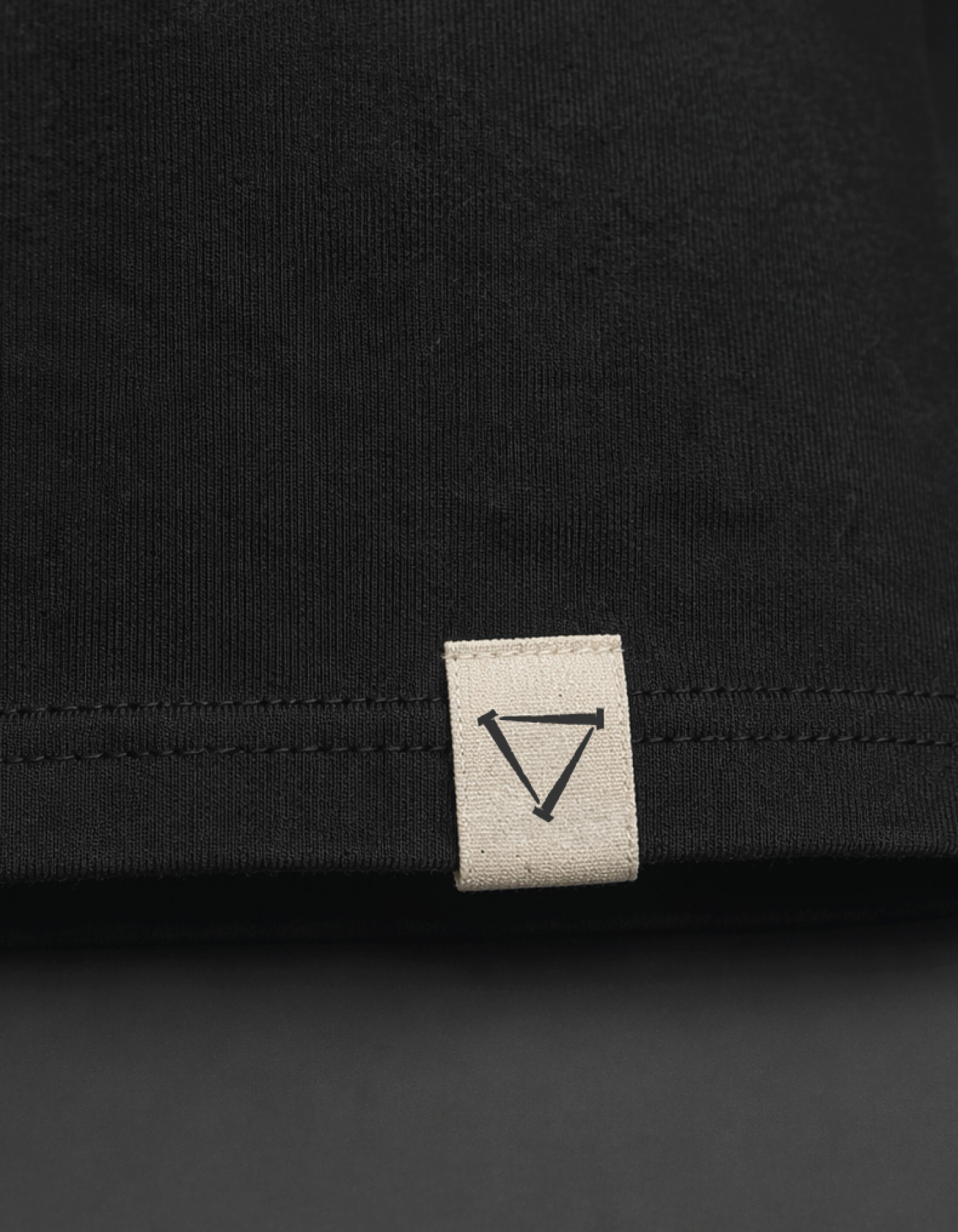

The shop
Nailed Up lives on the client’s existing Shopify site as its own page, next to the motorcycle products. It had to feel like a different world in a few seconds, without building a whole new site or adjusting the universal styling.
The headline is “Three nails changed everything”. He had a handful of strapline ideas, and this was the only one that tied back to the logo. Under it sits a lifestyle shot, a Steve McQueen quote and the six tees.
His story outline arrived as one long run of song lyrics, scripture and quotes. I broke it into short two-column cards, tightened the clunky lines and cut a couple of phrases nobody outside his head would understand. It reads as a page now rather than a brain dump.
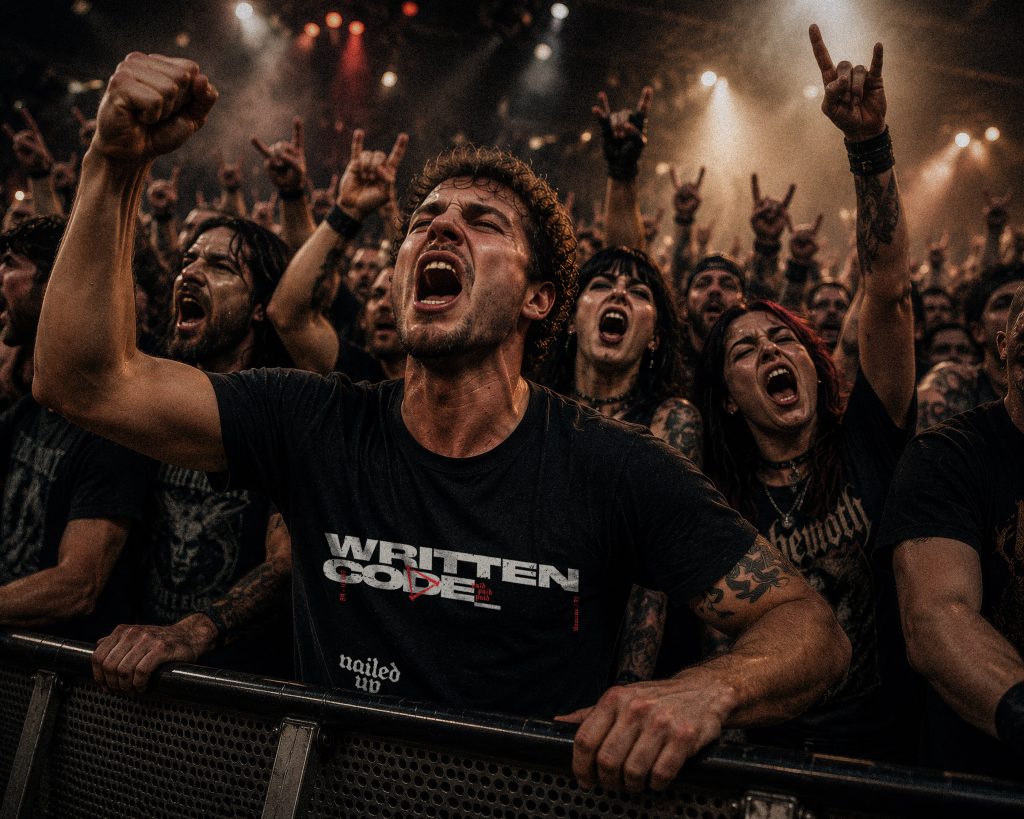
The lifestyle photos are AI-generated backdrops, as the tees were yet to be printed and the budget for this grassroots creation isn’t yet there. The designs on the tees are all mine, dropped on afterwards. Real photos are on the wish list!